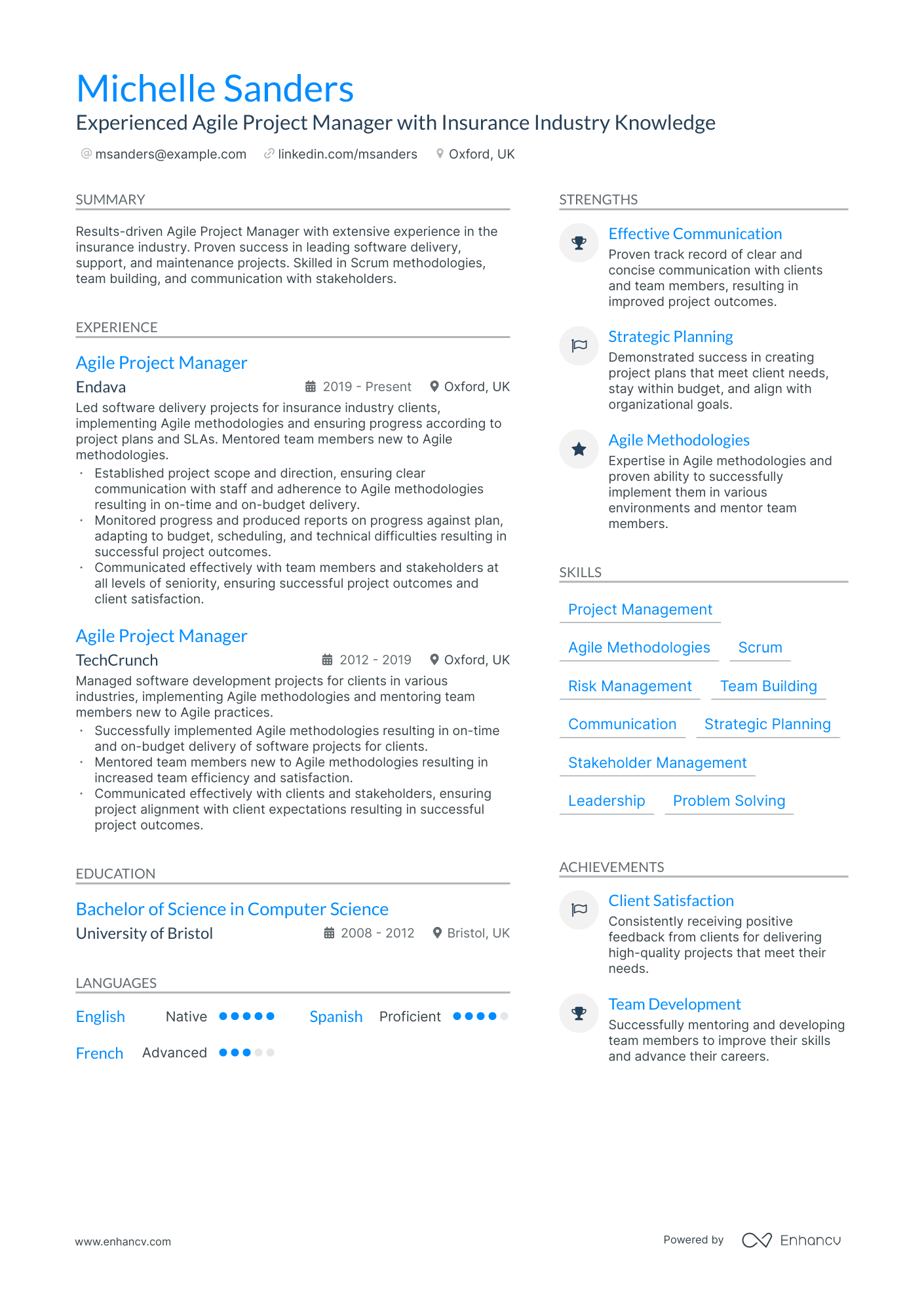
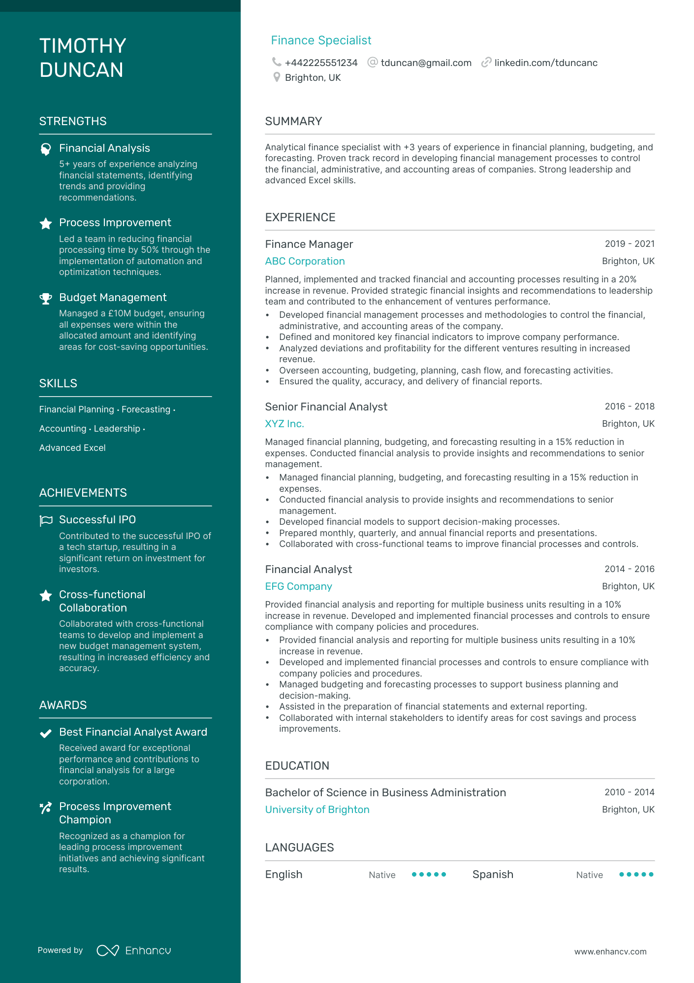
You’ve done the work of painstakingly crafting every detail of your CV. You’ve carefully selected your top accomplishments and highlighted your best skills.
However, you’ve overlooked an important feature.
The layout.
This may seem like a minor detail, but selecting the right layout for your CV is crucial for success.
Choosing an appealing layout might not come naturally. Especially for those of us without the gift of creativity.
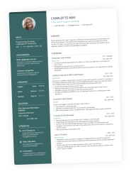
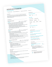
Don’t worry, we’ve broken down CV layouts to three major formats, each with their own strengths and uses.
Read our guide below to get a better idea of the right CV layout for your needs. Click to use any of the templates on this page or browse our massive collection of CV templates.
Let’s get started.
Is your resume good enough?
Drop your CV here or choose a file. PDF & DOCX only. Max 2MB file size.
What exactly is a CV layout and why does it matter?
The layout is essentially the format and structure of what appears on your CV. It covers the order, design, and overall look of your CV.
In the past, you might have just grabbed any old standard CV template from the internet and dropped in your own info. Choosing the right layout is actually a step that should be carefully considered just like any other aspect of your CV.
It is the first thing recruiters and hiring managers will notice before they read a single word of your CV. It impacts how and what information is presented to potential employers.
Your first impression begins before they even begin reading.
3 CV layouts to choose from
While the ways to format your CV are limitless, there are 3 major CV layouts to focus on. Each has their own strengths and benefits for different reasons.
There is no one-size-fits-all when it comes to CV layouts. Factors like industry, experience, and position are all things to consider.
Browse the examples below and decide which CV layout is the right fit for your needs.
Reverse chronological CV layout
The reverse chronological CV is the most common and widely recognized layout. It is probably what first comes to mind when you imagine the average CV.
The structure of this layout is exactly what the name implies. The focus is on your experience section, beginning with your most recent position and listing your work history timeline in reverse.
Who it’s great for
Because a reverse chronological CV puts all the emphasis on your work experience, this is the best choice for candidates with long, consistent careers.
Companies love to see career growth, especially for upper level C-suite roles.
If you’ve been in your field for more than 10 years and have advanced in the industry, this is the right layout for you.
The reverse chronological CV is the industry standard in a lot of traditional corporate jobs.
Candidates seeking a position in traditional roles like corporate business, finance, or executive and management will all benefit from this layout.
Example to use
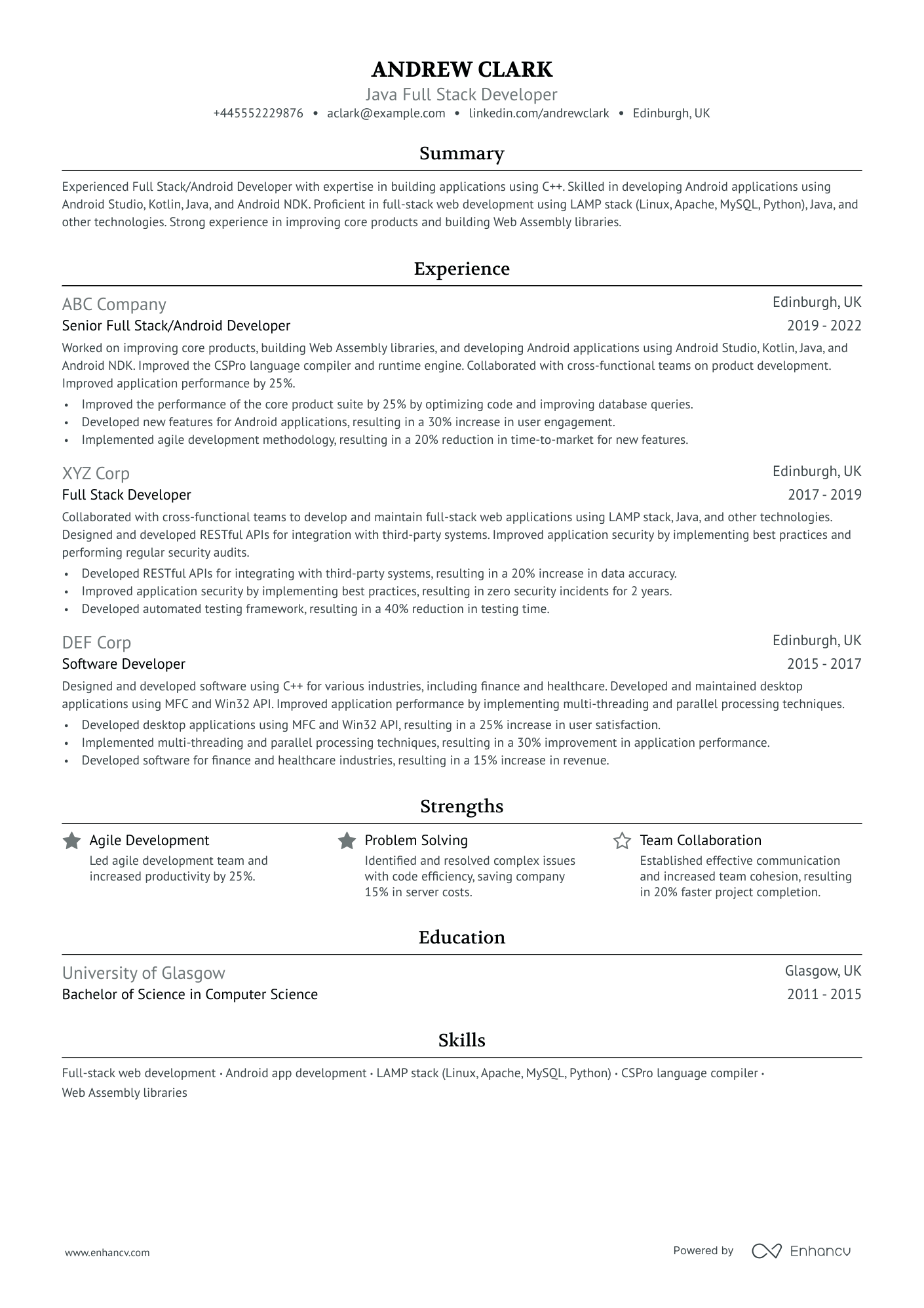
This is an example of a reverse chronological CV. Click on the image to edit this template in our CV builder.
This example works because:
- The experience section shows career growth and industry commitment
- The central focus is work history with a clear timeline
- Relevant strengths, education, and skills appear at the bottom
Functional CV layout
Next on the list is the functional CV layout. If the reverse chronological CV is all about experience, then the functional CV is all about skills.
This layout brings attention to your strengths and skills while your experience takes a back seat.
Sometimes skills are acquired outside the workplace or your work history isn’t the best representation of your abilities.
A functional CV layout shows potential employers what you’re capable of and why you have the right skills for the job.
Who it’s great for
The functional CV is a great choice for candidates who haven’t had the typical career path.
If you’ve jumped industries, have gaps in your timeline, or acquired skills in unexpected ways, this is the right layout for you.
Functional CVs are a great tool to highlight transferable skills. Maybe you’ve learned a lot in your current industry and are ready to bring those skills to a new arena.
For example, you’ve worked multiple jobs as a restaurant server and want to pivot to a customer service role in retail. Highlight your communication and service skills.
This is also a great choice for candidates who have gaps in their timeline. Maybe you took some time off to focus on your family or attend school or some other reason.
Interns, entry-level candidates, and career changers can all benefit from a functional CV layout.
By bringing the focus to your skills, gaps in your CV become less noticeable.
Example to use
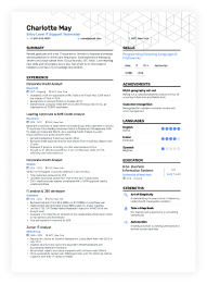
This is an example of a functional CV. Click on the image to edit this template in our CV builder.
This example works because:
- Strengths, skills, and achievements are highlighted
- There is a focus on transferable skills and industry knowledge
- The experience section doesn’t appear blank and fits into the layout
Hybrid CV layout
A hybrid CV takes components of the reverse chronological CV and functional CV to fit your specific needs. This is a customisable layout used to highlight certain sections.
Maybe neither the reverse chronological CV nor the functional CV is the perfect fit for you. If your career path has been a little outside the box, this is the right fit for you.
Some candidates might want to highlight their skills and experience equally. Or maybe you want to highlight another section entirely. That’s the beauty of customisation!
Who it’s great for
A hybrid CV layout is a great choice if you want to highlight unexpected sections like projects, volunteer work, or even hobbies.
Creative fields, unconventional positions, and freelance roles can all benefit from a hybrid CV layout.
Hybrid CVs are also a great choice for candidates who have had long careers with a lot of experience to choose from.
Highlight the strengths that are most relevant to your target job.
Focus on the aspects of your career that show potential employers why you’re the right candidate for the job, whatever they may be.
Example to use
This is an example of a hybrid CV. Click on the image to edit this template in our CV builder.
This example works because:
- It highlights strengths and achievements from different areas
- It is tailored to fit a specific job
- There is a focus on experience as well as skills
Common CV layout mistakes and how to avoid them
You’re almost in the home stretch! There are just a few more things to check before you’re ready to send off that amazing CV.
Here are a few of the most common pitfalls candidates run into when formatting their CV. Read our suggestions on how to fix them and double check your CV for any errors.
Too much white space
This is especially common for candidates who lack experience like interns and entry-level employees. If you don’t have a deep well to draw from, it’s easy to get stuck.
Here is where choosing the right layout plays a key role. Utilising the skills-focused functional CV layout or the customisable hybrid CV layout works to your advantage.
Position your information on the page so there is no blatant blank space. Too much white space will look incomplete and is unappealing to potential employers.
However, don’t swing too far in the other direction. Cramming a lot of information onto one page is equally unappealing. Strike the right balance with a good use of space.
Not tailoring your CV to fit the target job
Your CV should ALWAYS be tailored to fit the specific job you’re applying for. Blanket CVs with generic information won’t do you any favours.
Hiring managers have a lot of CVs to review and don’t want to waste time with irrelevant information. Everything on your CV should be relevant to the specific job.
Creating a new CV every time you apply for a job may seem like a lot of work, but it’s worth it in the long run.
Sending a few tailored CVs will get you farther than sending a lot of boring generic CVs.
Misuse of colours and fonts
Creating a CV that is visually appealing includes a strong combination of colours and fonts. A pleasant design will make your CV stand out from other candidates.
You want to use different colours and fonts to make your CV pop, but don’t use so many that it’s overwhelming to look at.
Too many bright colours and unusual fonts make your CV look busy and difficult to read. Hiring managers won’t waste time on a CV they have to struggle to read.
If you don’t have the best eye for design, don’t worry. Choose from the selection of colours and fonts in our CV builder to take the guesswork out of it.
Key takeaways for choosing the best CV layout for you
Understand the importance and impact of a strong CV layout. Assess your specific needs depending on factors like industry, experience, and role.
Review the unique advantages of reverse chronological CVs, functional CVs, and hybrid CVs. Decide what elements are the most beneficial to you.
Check your CV for common mistakes and make sure your layout is clear and easy to read. Always tailor your CV to fit your target job and show potential employers why you’re the right candidate for the role!

