Simple Resume Templates
Use a foolproof, simple resume template that focuses on your skills and strengths. To begin, select a resume design, type over the text and replace it with your own.
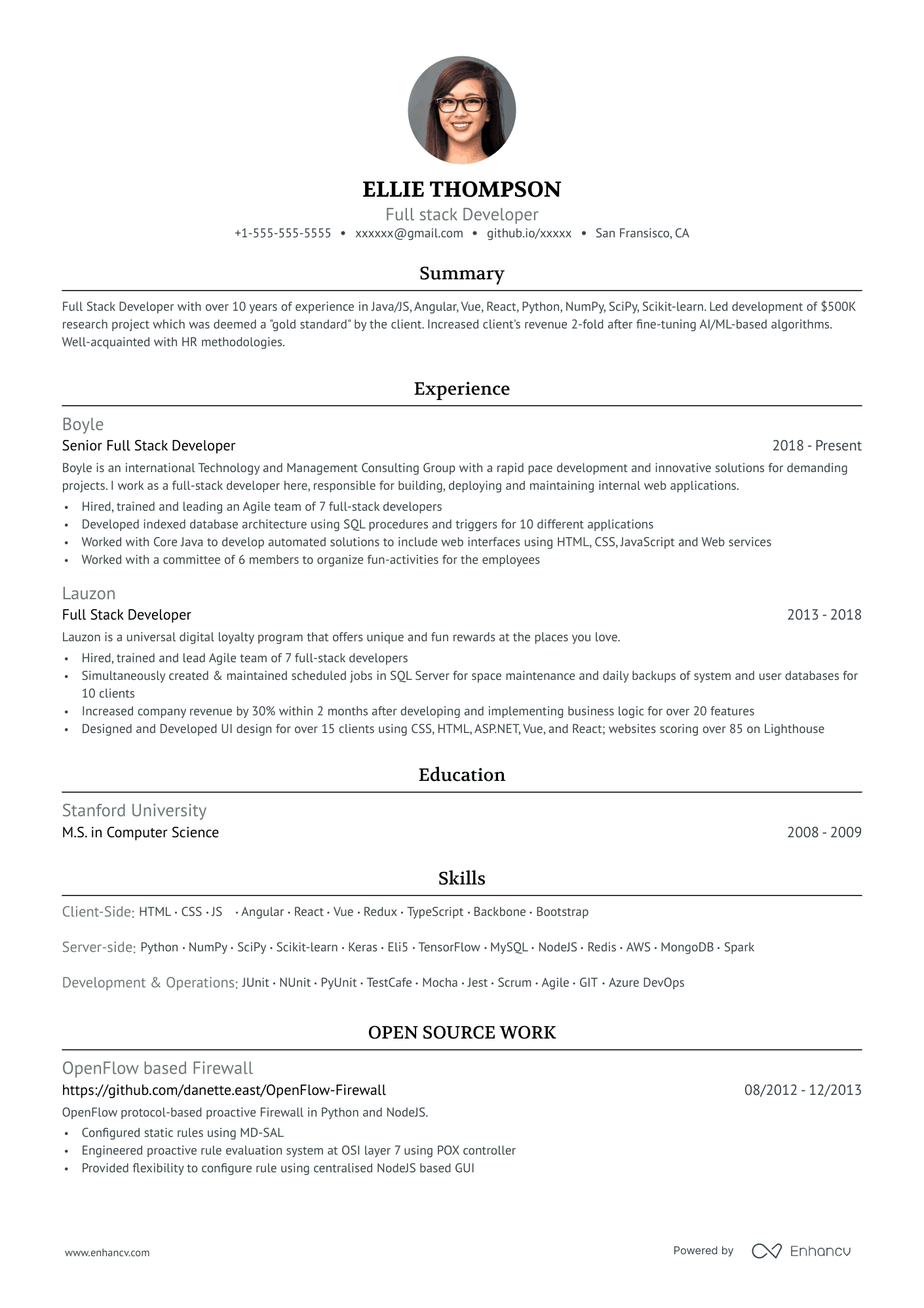
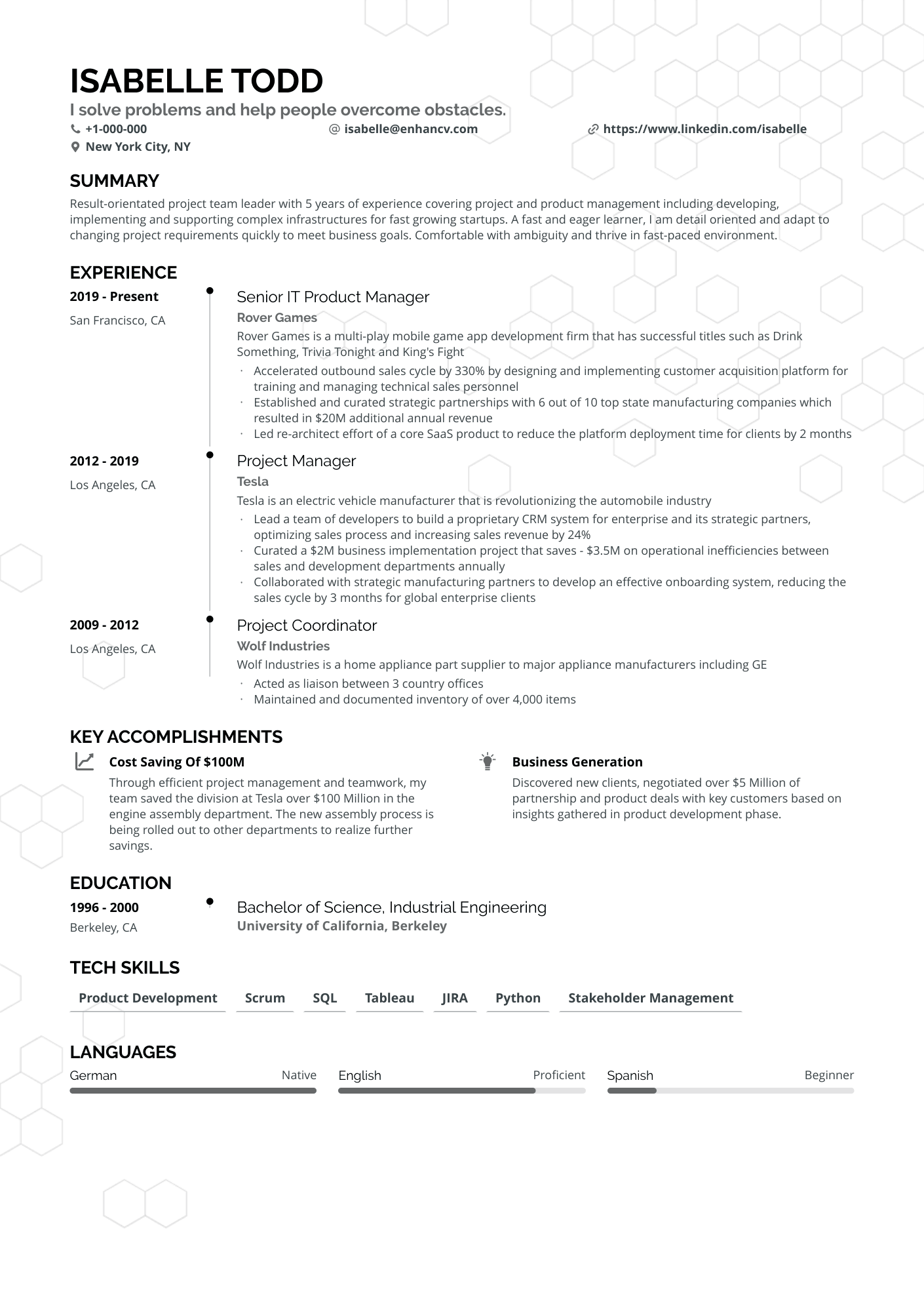
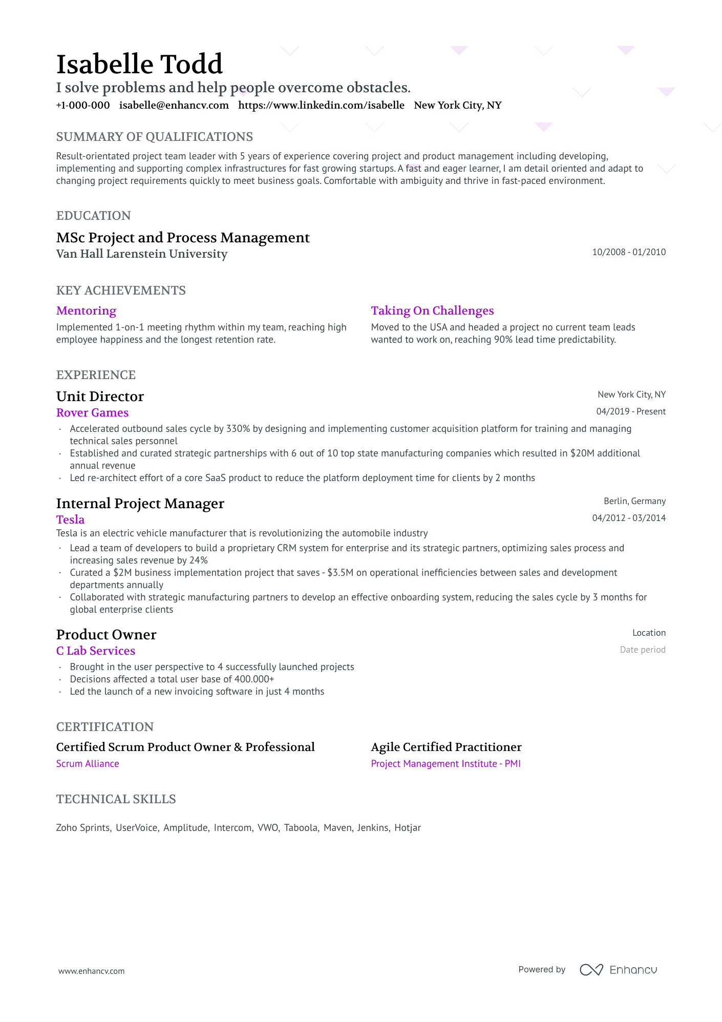
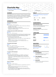
Ivy League
A modernized Harvard template featuring a sleek design favored by recruiters and an optimized structure for enhanced ATS performance.
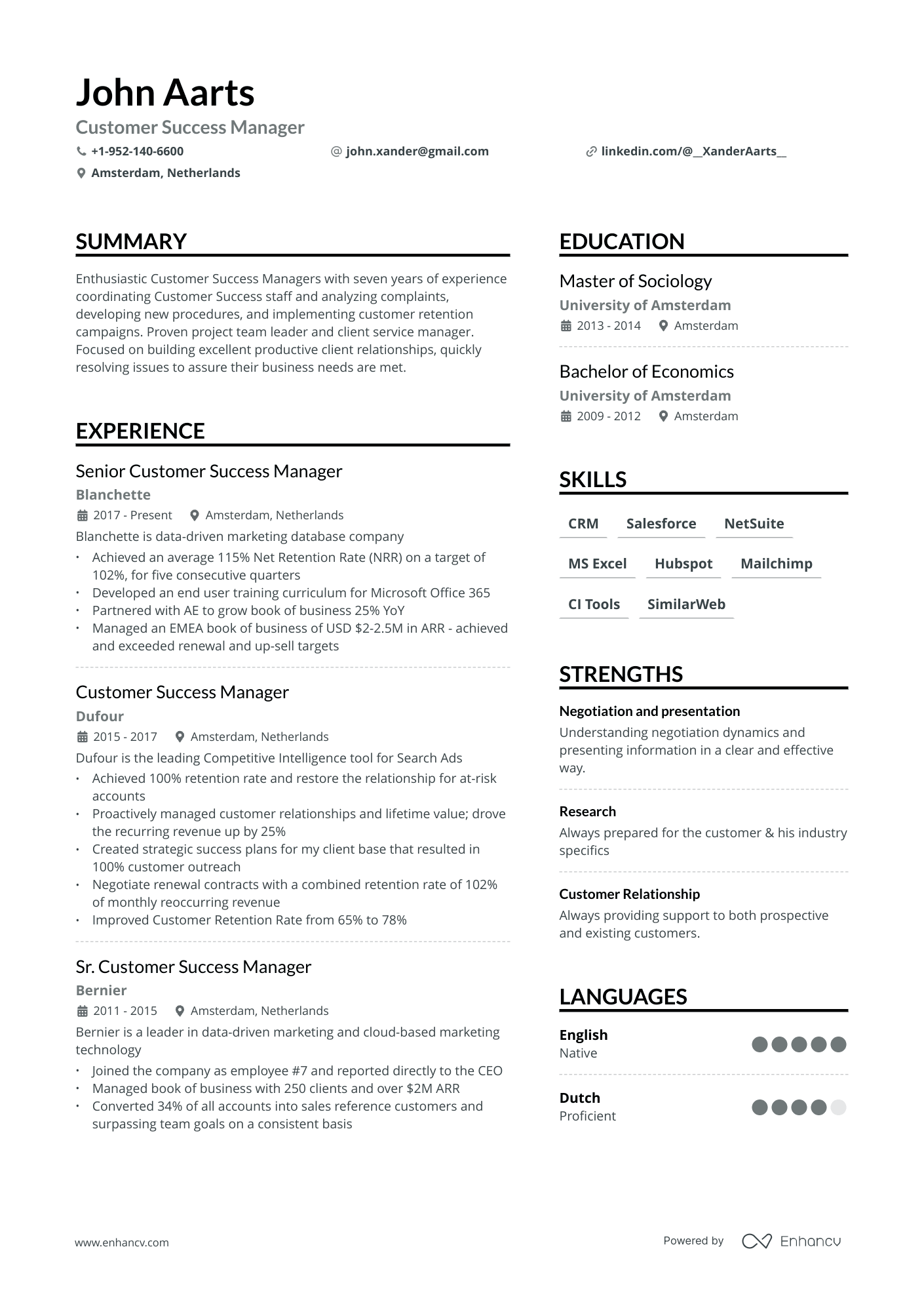
Double Column
A popular two-column resume template, free of charge, ideal for various roles, such as programming and marketing.
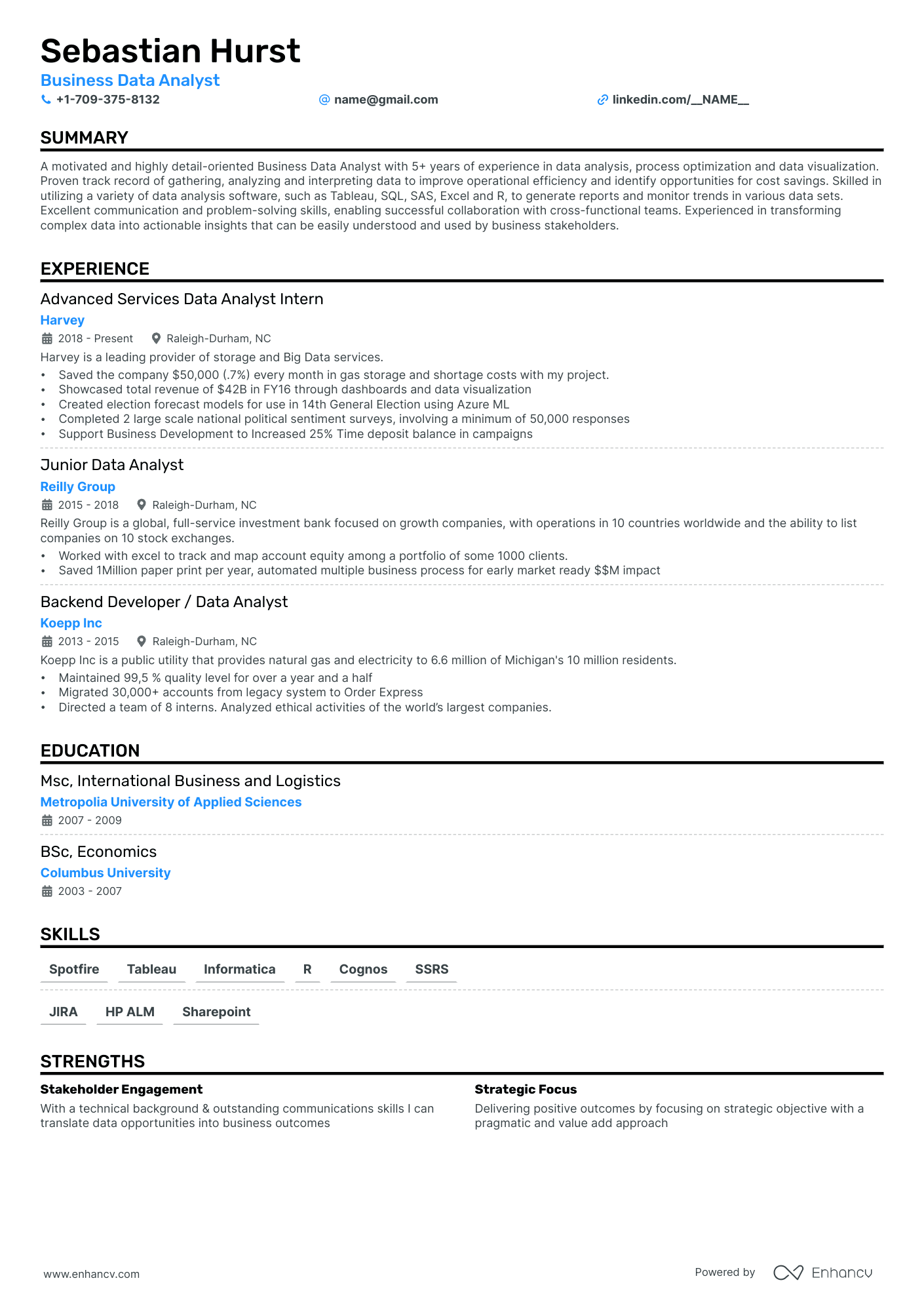
Single Column Refined
A traditional, simple resume template perfect for someone who's just starting out their professional career.
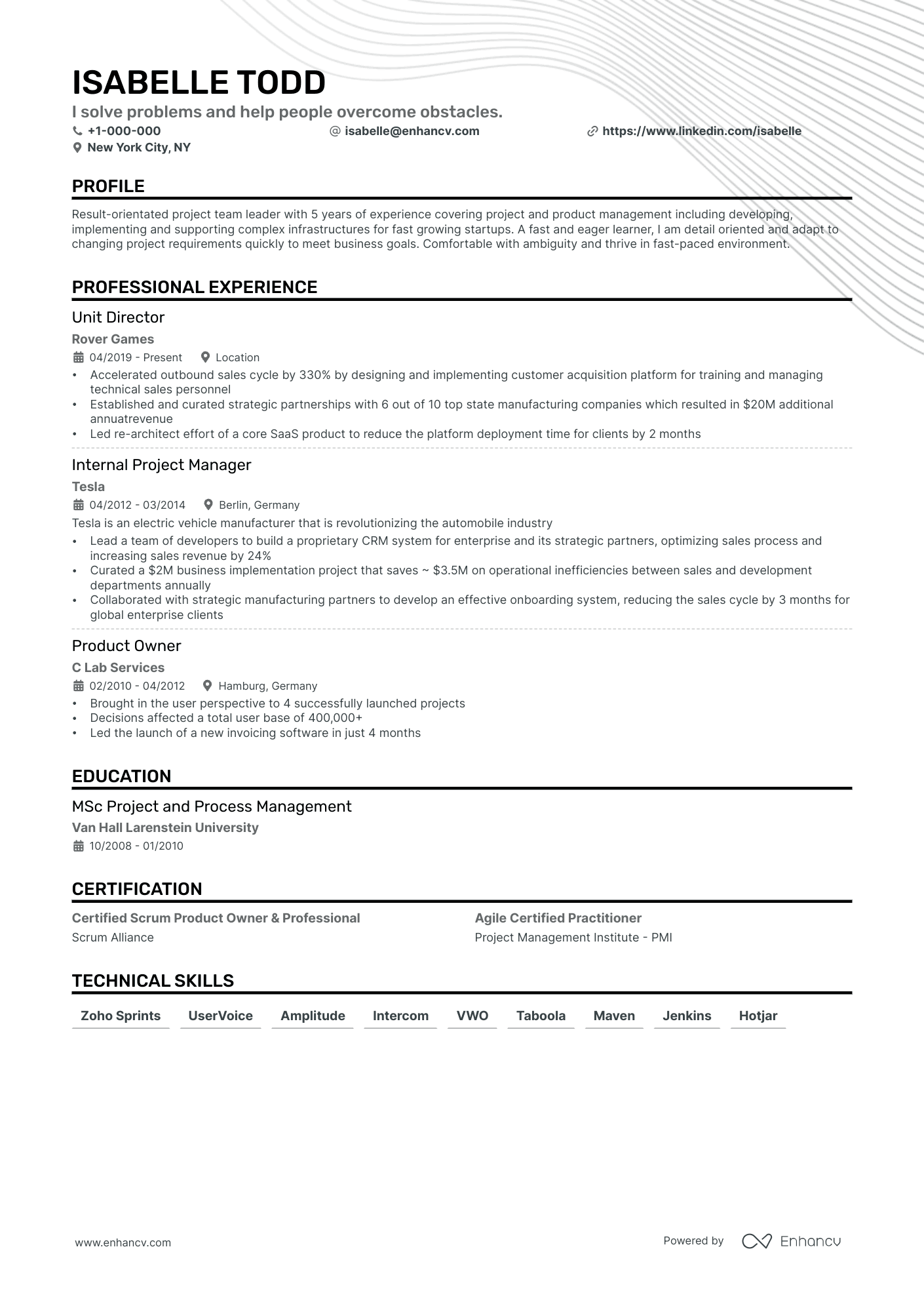
Single Column
The well-known single-column template with a traditional, yet time-tested layout. Perfect for conservative industries.
If you're looking for a timeless, evergreen template, the simple or basic resume is your top choice. Candidates can use this clean, minimalist format to curate what matters most to the job - their relevant experience.
One of the biggest benefits of using the basic template is that your resume becomes easy to scan.
What is more, simple resume formats are an ideal choice for candidates, regardless of their experience level.
This organized layout offers industry professionals an efficient and streamlined approach to:
- present their experience, especially for industries where your professional track record speaks for itself;
- highlight basic skills that are important for new to the workforce candidates (e.g. students, interns, etc.).
What is a simple resume?
The simple resume template is a clear and concise way to format your resume.
The basic design aims to draw attention to your professional qualities and achievements. Thus presenting them in a systematic and easy-to-read fashion.
Pro tip
This minimalistic and orderly approach should help you stand out in a crowd of professionals who have invested in fancy design, instead of relevant content (in the form of their experience).
What characterizes the simple resume is the lack of clutter in intricate formatting.
This specific resume design excludes over-the-top elements; bright and energetic colors; and fancy, unreadable fonts.
By keeping the design simple, you'd cut to the chase to provide recruiters with a simple, yet very effective overview of your experience.
Speaking of your professional expertise, the basic resume template works perfectly well with all three best-practice formats.
Select the one that fits your experience best:
- reverse chronological - arranging your experience in a chronological manner, starting with your latest role;
- functional/ skill-based - shifting the focus from your experience to your strengths and unique skill set;
- hybrid - balancing both skills and expertise.
Usually, candidates opt to present their professional experience via a double-column, simple resume that includes their:
Pro tip
Dedicate some resume space to highlight the specifics of your experience - awards, strengths, and accomplishments.
This would also help you to make a more personable impression on the recruiters.
Use the simple resume template to:
- save time - creating and updating your resume within the blink of an eye;
- highlight your experience - your content and essential information take center stage;
- create an easy-to-read experience - thus following a structured, clean logic and presentation;
- leave a more professional impression.
When to use a simple/basic resume?
Use the basic resume formatting to organize qualifications with a focus on your career.
The minimalist, simple resume presentation hints at a variety of soft skills you possess, e.g. organization and presentation.
The basic design offers endless opportunities for professionals across different industries and niches.
No matter the job you're applying for, your experience level, or the competition for the role - a simple resume could allow you to stand out.
What is more, this basic template is perfect for both:
- recruiters - as the format is easy to scan over;
- ATS (or Applicant Tracking System) - the software, used to assess candidate profiles, could easily match different sections of your resume to job criteria.
So, when should you use this easy resume template?
Use the simple resume format when your experience is self-explanatory and relevant to the role
You have all the relevant skills that just don't need a fancy presentation.
With basic resume formatting, you'd show recruiters that you have what it takes for the job.
Candidates within these two fields benefit the most from a simple resume template:
- labor-focused - e.g. construction; transportation and logistics; maintenance and repair; etc.
- traditional or technical roles - e.g. automotive and aviation; education; law; medicine; etc.
Use the simple resume format to show how your experience aligns with basic job requirements
Just about to kick off your career, you’re a student, intern, or entry-level professional.
With your application, you'd like to show that you cover the core requirements of the role.
Utilize the simple resume format to spotlight your professional work ethic and your unique skill set.
What sections to include in a simple/basic resume?
The basic resume template allows you more time to get creative and perfect your resume content.
Make sure your resume includes at least six of the below sections to curate the specifics of your experience.
Header
Ensure that your simple resume header is clear, professional, and includes up-to-date information, like your:
- Headline
- Phone number
- Email address
- Location (city, state)
- Professional website/ portfolio or LinkedIn profile
Pro tip
Your headline is the perfect opportunity to communicate your current role and expertise.
E.g. "AI developer perfecting the code of ChatGPT"
Alternatively, you could keep your headline simple and include the exact job position you're applying for.
Career summary or objective
Let's build up your resume further with a minimalistic approach to your summary or objective statement.
Write a resume summary when applying for more traditional roles where experience and skills are key.
Use the resume summary as an overview of your key qualifications, qualities, and achievements - and how they'd match the job.
Meanwhile, the objective statement is one of the best choices out there for entry-level professionals.
Candidates can align their best skills to the job while offering a more long-term perspective of their career goals.
Whichever option you choose, make sure to keep it concise (up to three sentences) and to use active language.
Professional experience
When writing your resume experience section, always make sure that it's easy to read (and is clear for recruiters).
You can do so by aligning your work history to the job advert and selecting only the most relevant items.
The resume experience is basically your proof - it's what backs up your credentials, career goals, and success.
Using the basic resume template, list all relevant roles, followed by:
- company name
- location (city/ state or city/ country)
- start-end dates
- achievements.
Opt to organize your experience items based on how applicable it is to the job.
Also, instead of creating a never-ending list of responsibilities, curate items that detail your success backed up by hard/soft skills and outcomes.
Bullet points that correspond the most with the advert should be listed closer to the top.
Skills
One of the best ways to ensure that all relevant job keywords are part of your resume is via the skills section to showcase:
- Hard skills - your technical and software proficiencies, specific to the job;
- Soft skills - your personal competencies and strengths; an added value to your experience.
Pro tip
Education
The education section is especially important for entry-level candidates, who may not have as much experience that ties them to the industry.
We suggest you use it as a coherent bridge: between the role you're applying for and your professional capacities.
List the most recent or advanced degree first, working in reverse chronological order, and include:
- name of the institution
- degree obtained (pursuing)
- location (city/ state)
- graduation dates.
A simple rule of thumb: always consider the relevancy of your education to the role.
Take for example the following scenario: you are applying for a job in operation management and logistics.
But, after high school, you decided it was not the best time to continue your education.
You should definitely leave your high school diploma out of your resume.
Instead, focus on all certificates you happen to have that pertain to the job.
Achievements / Awards
A clear basic resume template also curates your career highlights with either your achievements (strengths) or awards.
These two (or three) specific sections bring recruiters’ attention to:
- achievements/ strengths - the array of skills (you have grown over time) that make you a strong candidate;
- awards - unique accomplishments within your industry or field that help you stand out.
Tips for building a simple/basic resume
The first tip to achieving a timeless, classic feel of your simple resume is this - be consistent all through.
The basic template shifts the focus from design to the actual resume content. So, be mindful of even the smallest design elements you decide to include.
Furthermore, when building your next simple resume, consider these four aspects.
Simple Resume Design
The design needs to be clean and straightforward.
All sections need to be efficiently organized while avoiding cluttered layouts, many decorative elements (e.g. icons), and excessive use of graphs.
Within your basic resume, include the five standard sections that allow hiring managers to determine whether you qualify for the job. Those include:
- Header
- Summary (or Objective)
- Experience
- Education
- Skills
Basic Resume Fonts
The end goal of your resume is for you to land the job - that's why you should prioritize legibility over creativity.
The simple template allows you to do just that.
Use classic, easy-to-read fonts (e.g. Bitter and Oswald), as they are more widely accepted for professional presentations.
The font size of your basic resume content should be between 10 - 12 points. You should use a bit larger font size for your name (14 - 16 pt); resume section headings, like Experience and Education, and headline (12 - 14 pt); and subheadings like job titles, company names, etc. (11 - 12 pt).
If you decide to spice up your simple resume with text in bold, italics, or underlined - do so to emphasize vital information.
Make sure that no matter the font you select, it does not take away the focus from your expertise.
Simple Resume Colors
Including colors on your resume that are too bright and contrasting may distract the recruiters. Thus, making your profile seem cluttered and unprofessional.
Simple resume templates avoid any over-the-top color combinations by sticking to a limited palette.
Most often, basic resume colors are neutral with:
- one primary color - this is usually in the grayscale, and
- one accent color - highlighting key information, like achievements.
If you decide to use different colors throughout your resume, do so sparingly and ensure that there is consistency all through your design.
Basic Resume Layout
The simple resume layout should be clean, easy to read, and polished.
How you order different resume sections is key to achieving a minimalistic and professional resume.
First off - stay clear of complex layouts.
As, when your resume is scanned by the ATS, a fancy layout could deceive the software. Hence, misaligning job requirements with, let's say, your education or hobbies section.
Next, select between a single- or double-column format to effectively utilize resume space. The single column can be an excellent choice if you happen to have less professional experience.
Your resume shouldn't be longer than two pages. In most cases, the one-page format is entirely sufficient. But, if you happen to have more than a decade of relevant experience, curate it via the two-page format.
Pro tip
Basic resume formatting tips
Now that we've laid out the basics of the simple resume template design, let's dive deeper into the rabbit hole with four more key tips.
Find out more about the importance of white space, active language, simple fonts, and the right colors.
Use white space
Keep your resume easy to scan and orderly by avoiding large blocks of text.
By incorporating plenty of white space, you would:
- create a clean and uncluttered layout;
- draw attention to separate resume sections;
- structure the resume with clear boundaries;
- emphasize essential information.
The white space of your simple resume should be used to achieve an aesthetically pleasing, timeless, and professional design.
Focus on short and quantifiable sentences for your experience sentence
Have you heard of the KISS principle: keep it short and simple?
Apply KISS when listing the experience bullets within your resume.
Curate short sentences that include:
- action verbs - to better pace your resume;
- hard skills - competency using particular software;
- soft skills - to display personal skills;
- results of your efforts.
Whenever possible, use numbers to show the more tangible outcomes of your success.
Choose simple fonts
Clean and timeless fonts sustain your simple resume's readability and order.
Generally, hiring managers have high regard for these professional fonts:
- Times New Roman
- Montserrat
- Calibri
- Bitter
- Cambria
- Oswald
- Volkhov
A simple font could help you accent what makes your experience unique.
Use the right colors
An effective, simple resume format presents your qualifications using subtle and consistent colors.
Some popular color combinations for your basic resume template include a white background with
- navy blue, dark red velvet, or dark green text - to create a sense of sophistication;
- text in earth tones - adding a sustainable twist to your resume;
- black text combined with a pop of color - use a lively, energetic color (e.g. orange or pink) to highlight key elements;
- text in the monochromatic color scheme - different shades of the same color (e.g. red) to emphasize important resume sections.
When in doubt if colors would shift the focus away from your experience, stick with the grayscale palette.
The classic, timeless black text on a white background provides a clean and professional look.
Meanwhile, having gray text on a white background is a subtle and elegant design.
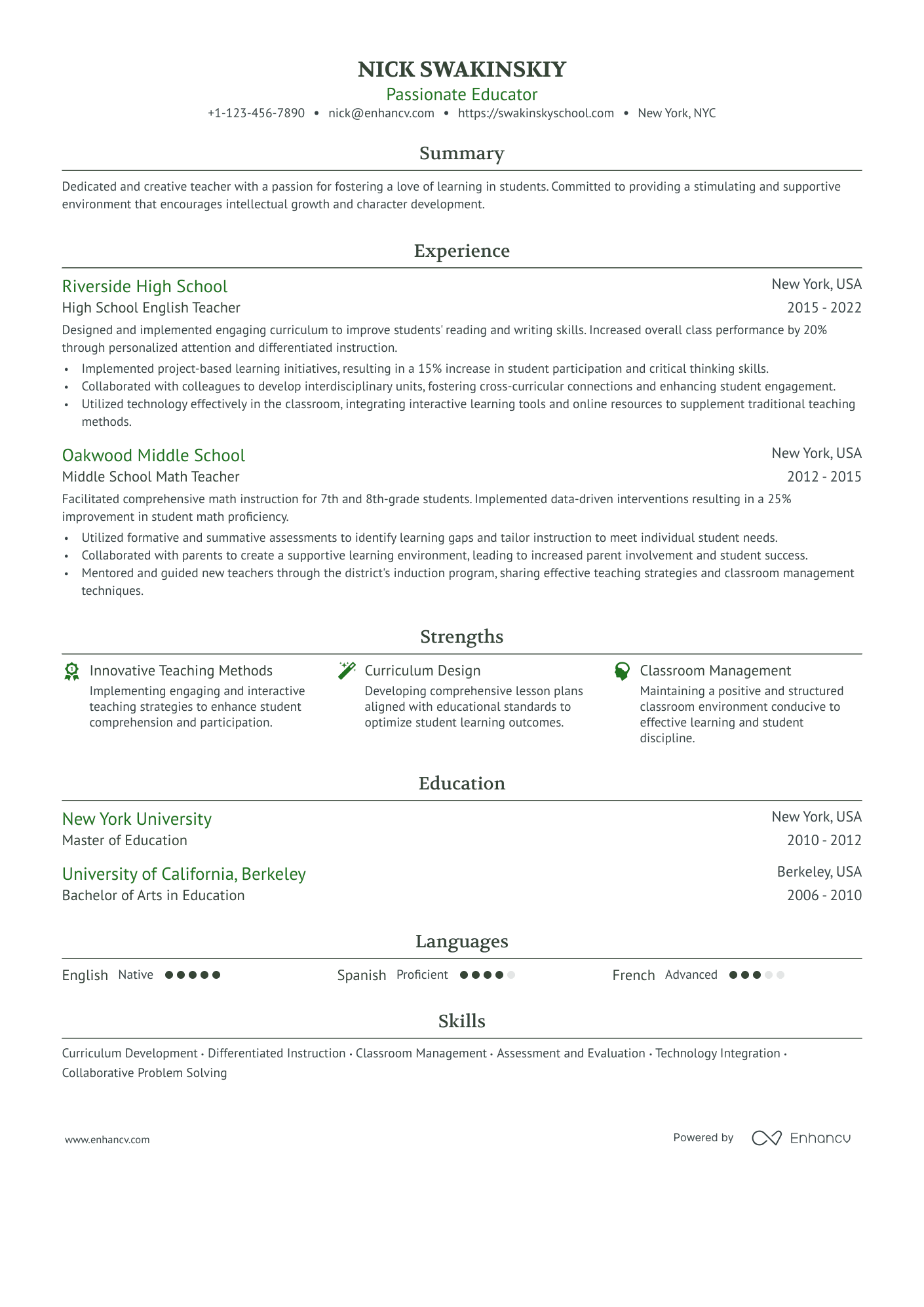
Teacher simple resume
This simple, elegant one-column design provides hiring managers with the right amount of information to better understand the teacher's experience.
The top one-third of the resume includes all mandatory information:
- all relevant, professional contact details in the headline;
- industry keywords and an array of soft skills listed in the summary.
The focus is then shifted to the teacher's experience. Each role offers an overview of the key skills and results achieved, e.g.:
- interdisciplinary collaboration - higher student engagement;
- data-driven interventions - improved student proficiency;
- personalized approach - increased performance.
If recruiters are looking for the unique value this professional offers, they need to look no further than strengths.
This resume section clearly pinpoints the areas in which the individual excels.
Other relevant sections are used to showcase the teacher's academic background (education and language skills).
Finally, hiring managers can discover even more relevant skills, listed at the bottom of the resume. They are included as keywords to ensure that all job requirements are covered.
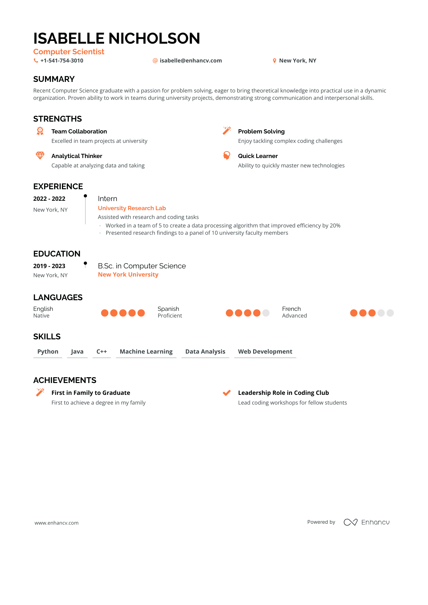
New grad simple resume
This new grad resume shows what you could do if you don't have much professional experience.
The basic resume uses bright colors to accent key information (headline, roles) and design elements (icons).
After the resume musts (headline and summary), the candidate curates the following information to fill in the lack of experience:
- strengths - what is the unique value of working with this newly graduate person;
- internship - to highlight relevant industry know-how;
- education and languages - to showcase how the candidate has grown professionally in the last few years.
The skills section is built on technical ones that are relevant to the industry.
Achievements are added for a more personalized element to the application.
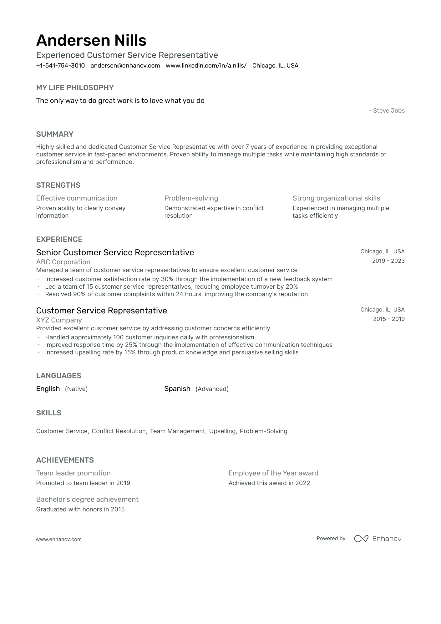
Customer service representative simple resume
A single-column, grayscale colors, not a single graphic in sight. The basic candidate resume's main superstar is the professional narrative or experience.
Within the example, we find industry buzzwords within the headline, followed by the candidate's life philosophy. This approach is to help the customer service representative show more personality.
The resume summary offers a quick snapshot of experience, achievements, and skills.
If you want to further highlight your skill set, the strengths section could be subsequent. The candidate uses it to spotlight industry skills (e.g. communication, problem-solving, and organization).
Note how each experience bullet is formatted with active language to demonstrate success.
Languages and soft skills play a vital role in the customer service world. They should thus have a prominent role in your simple resume.
Achievements (e.g. promotions, awards, and higher education degrees) feature more noteworthy information to support the candidate's application.
Accountant simple resume
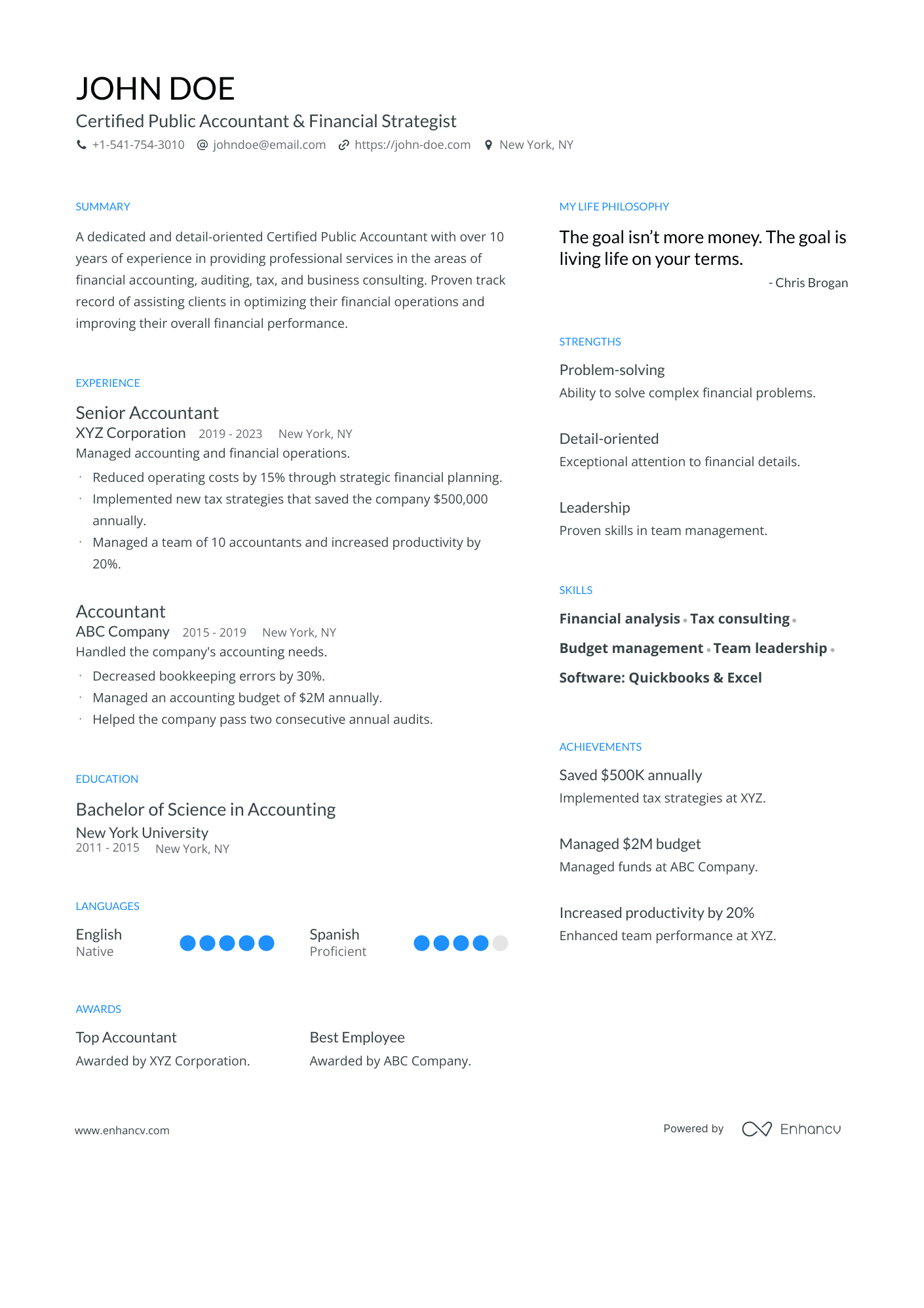
This accountant resume is another excellent example of the basic resume template design. The candidate has listed all information with colors in the grayscale, while section names stand out in blue.
The top one-third of the resume may be short but offers insights on candidate certifications, skills, niche areas of expertise, and success.
The quote is a bit more outside-the-box approach, giving a bit more character to the candidate's resume.
This simple resume is split into two columns, curating specific information to answer why employers should hire this candidate.
Within the left-hand column, they'd find listed:
- experience - short bullets that demonstrate achievements;
- education - all relevant higher education degrees;
- language proficiencies - to show a breadth of communication skills;
- awards - as proof of work success.
The simple resume right-hand column lists:
- strengths - focusing on key soft skills that boost the candidate's performance;
- skills - both hard and soft skills to match the job requirements;
- achievements - tangible results, proven with numbers.
Content writer simple resume
Who says you have to go all out with your resume design if you're applying for a role within a creative field?
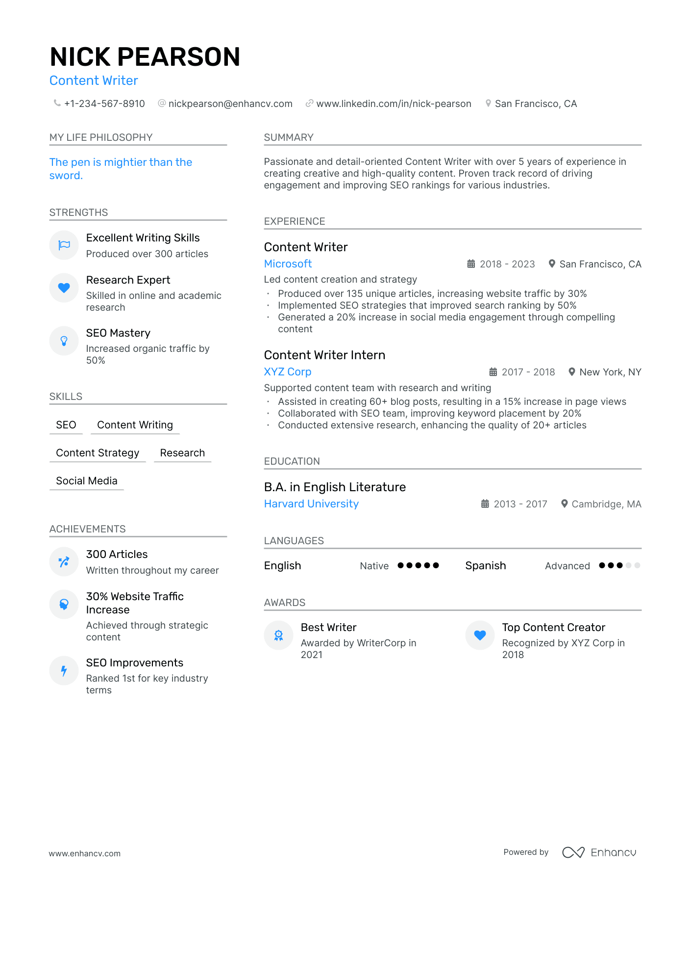
The design of this basic content writer resume features:
- headline, icons, companies, and institutions highlighted in electric blue;
- key resume sections organized in a double-column format;
- plenty of white space to ensure the resume's readability.
Notice how the strengths, skills, and achievements sections are curated. In the left-hand column, you'll discover a snapshot of the candidate profile with tangible outcomes and industry keywords.
Moving on to the experience bullets - the resume uses a "skill + results" formula to create a further sense of credibility. If the candidate lists “wrote 300 articles” - this won't provide context to anyone assessing the resume.
Finally, the two awards listed in the resume celebrate the candidate's success within the industry.
Administrative assistant simple resume
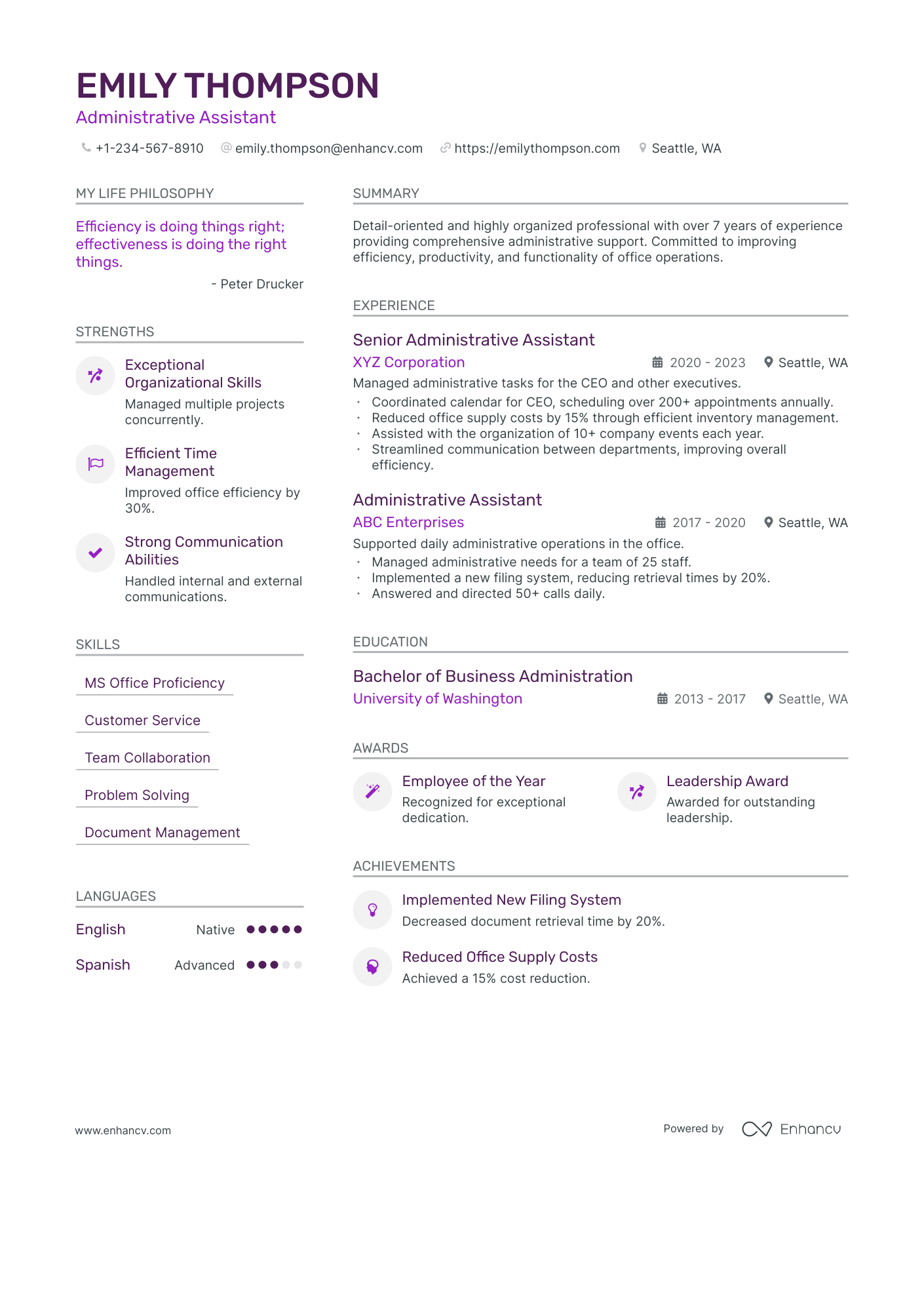
The basic resume colors are in a monochromatic scheme with:
- dark purple highlighting key information (name, skills, past roles);
- lighter purple is used for secondary elements (headline, quote, company names, institutions, icons).
After assessing the initial information, at the top of the resume, recruiters' attention is immediately drawn to the strengths and experience sections.
Both are formatted to feature skills and perceptible achievements - vital for organizational success and/or professional growth.
This double-column simple resume goes on to spotlight other relevant sections like
- skills
- education
- awards
- languages
The candidate's achievements are once more backed up with tangible results.
The simple resume ultimately reveals the unique value of working with this candidate and her professional interests.
Legal assistant simple resume
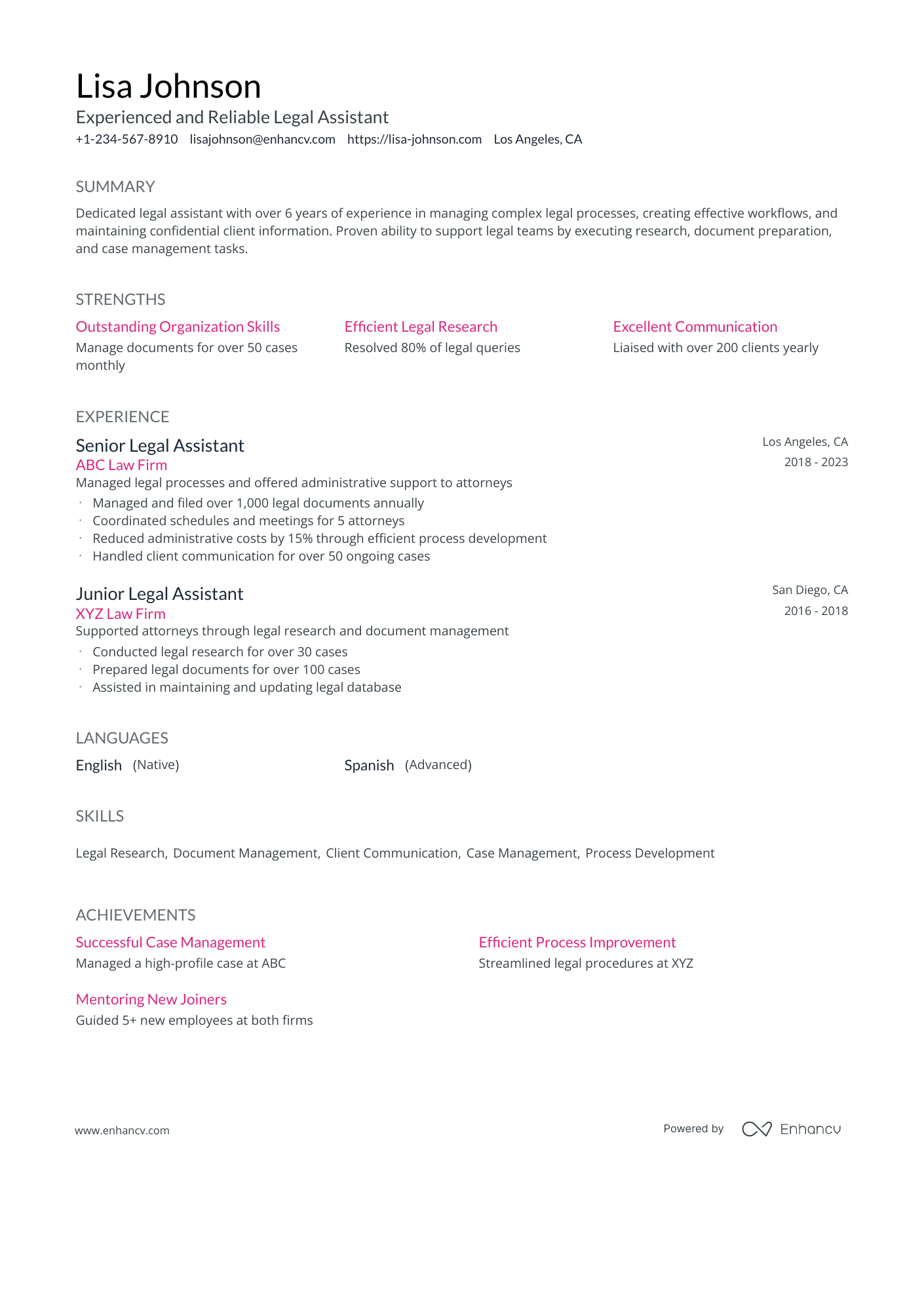
There's nothing better than a quick summary that gets to the point in two sentences. The simple resume allows recruiters to have a quick overview and understand if the candidate's profile aligns with the job requirements.
What is more, the legal assistant builds up her case by investing in different resume sections like:
- strengths - hinting at success within a particular skill;
- experience - proving niche, industry knowledge into how a legal firm works;
- skills - including other job requirements as listed in the advert;
- languages - showing an ability to communicate internationally.
The resume achievements section can be a nice feature of how you go above and beyond in your day-to-day work.
Finally, let's talk about the design. Its key elements include legibility, one-column formatting, and vital elements (skills and company names) in pink. This minimalistic approach helps the candidate stand out.
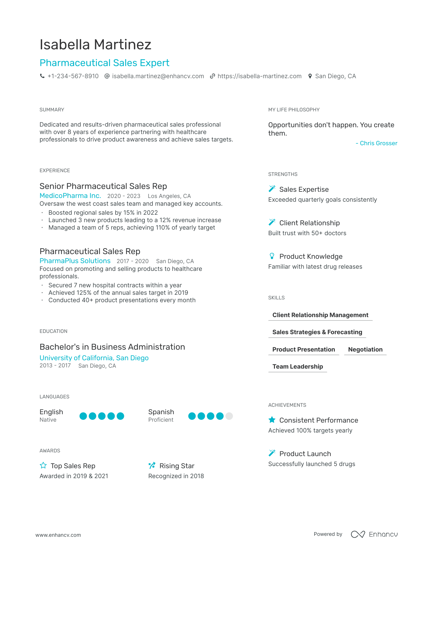
Pharmaceutical sales simple resume
This simple pharmaceutical sales expert resume has a clean and orderly approach to presenting the candidate profile.
It kicks off with the headline, summary, and life philosophy - which align industry buzzwords with the candidate's mindset.
What is more, the double-column resume offers recruiters insights into the candidates':
- specific skill set - most prominent in the experience and strengths sections;
- academic background - listing relevant higher education degrees and languages;
- career highlights - achievements and awards spotlight the candidate's soft skills and professional bests.
The basic resume format achieves the perfect balance in the design, with ample white space to highlight key career moments.
The resume helps specific information stand out in an ocean blue color while sticking with the timeless black-and-white combination for the rest of the text.

