Resume Templates with Photo
Including a photo on your resume can make a memorable first impression, helping recruiters quickly connect a face to your name. It can also enhance personal branding by visually showcasing a professional look that aligns with your industry or role. We'll present to you how each of our resume templates looks like when you include a photo, so you can easily start creating your resume.
Double Column
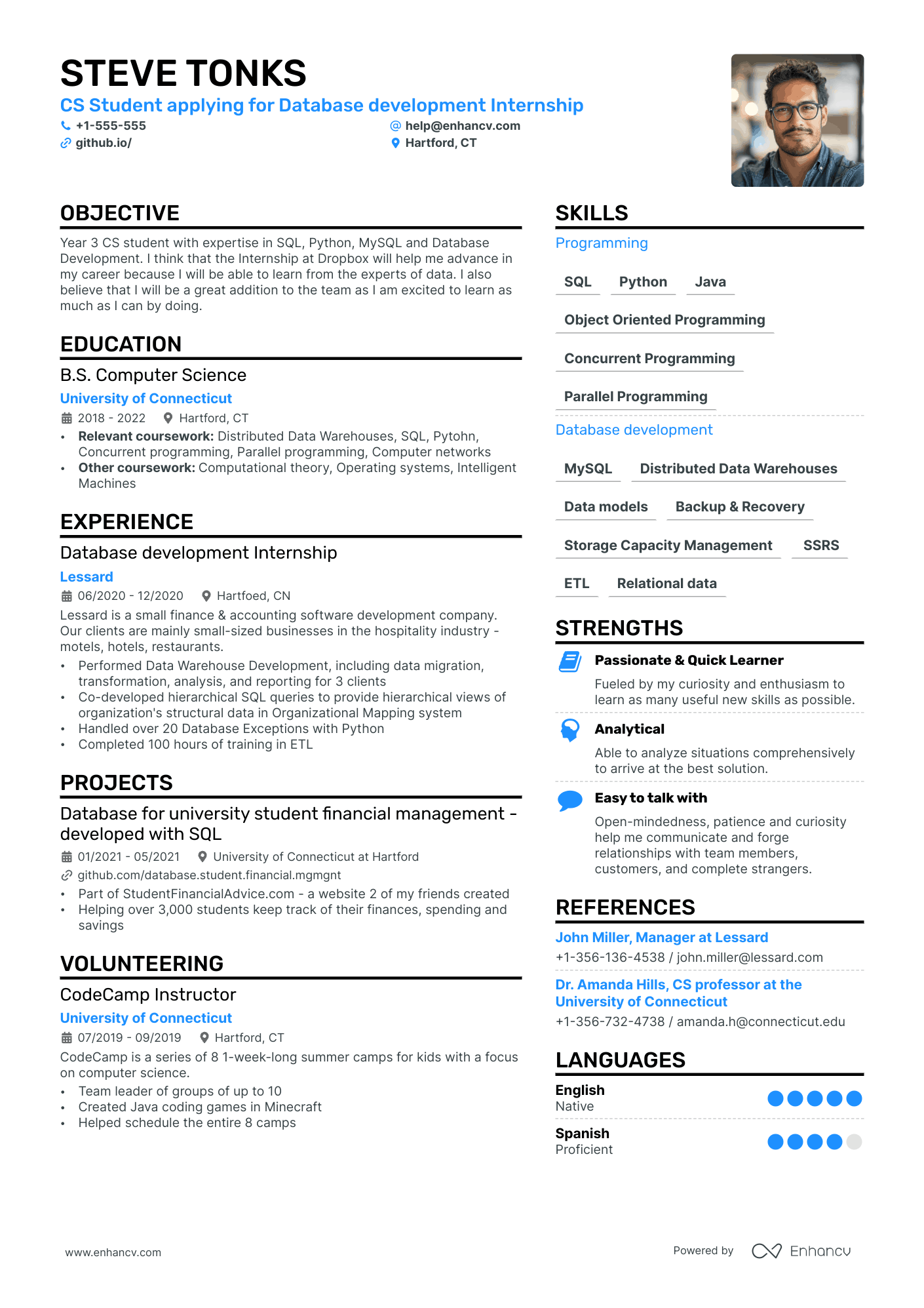
The structure and layout of this template are designed for easy readability, helping your application stand out among the dozens of resumes recruiters review. With its double-column format and space for a professional photo, it combines visual appeal with clarity to make a lasting impression.
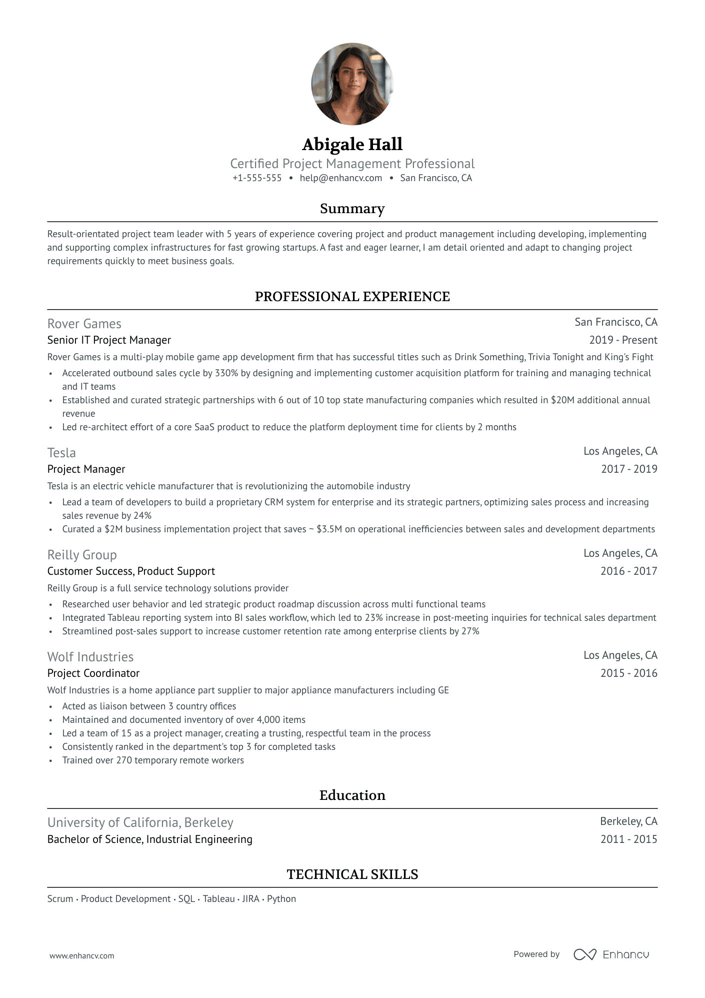
Ivy League
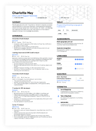
This Ivy League-inspired template brings a polished, modern twist to the classic Harvard design, offering a standout look with a refined feel. Its compact layout provides space for key sections like a tailored summary and strengths, all while maintaining clean whitespace and an area for a professional photo.
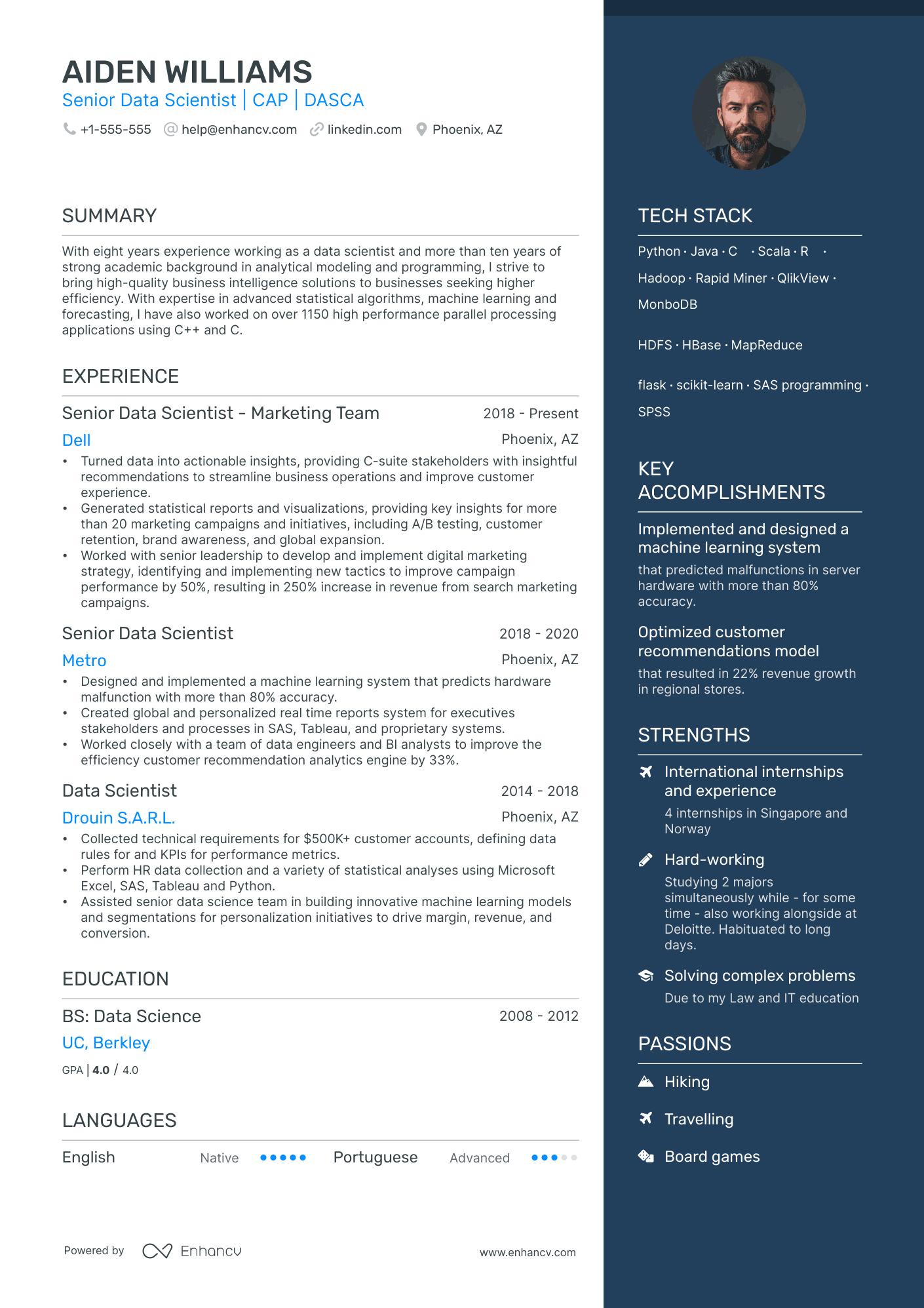
Elegant
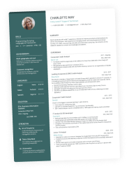
An elegant template that showcases the applicant's strengths and unique qualities in a dedicated side column, while prioritizing ample space for employment history and education. With a sleek design and room for a professional photo, it strikes a perfect balance between personality and professionalism.
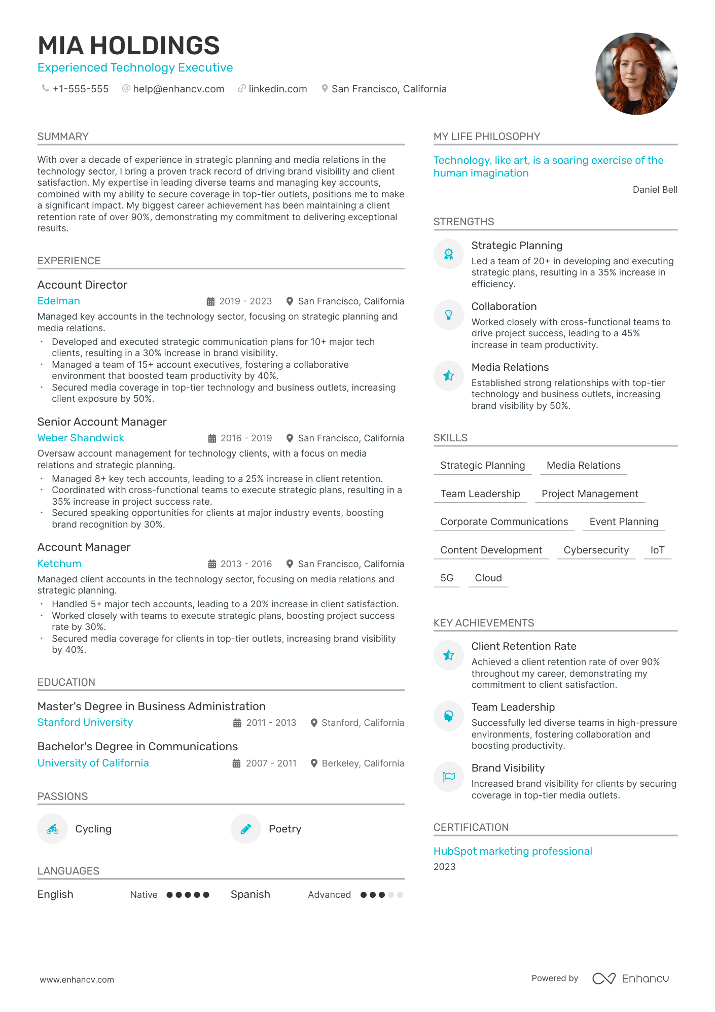
Modern
This modern template has been Enhancv’s top choice among users for three years straight. It effectively organizes extensive information on a single page, ensuring readability, and includes a section for a profile image to create a memorable first impression.
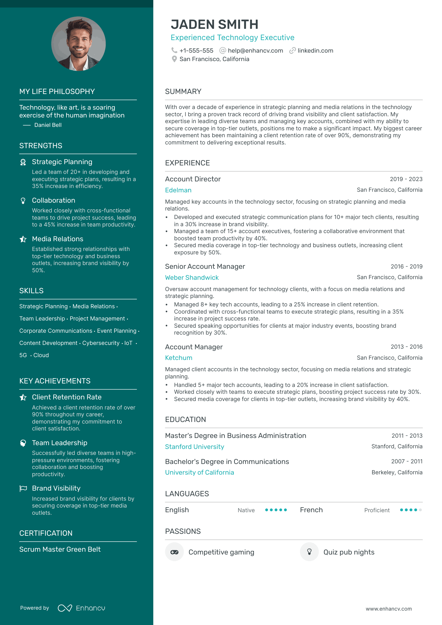
Polished
A polished design that maintains a professional look, with space for a profile image to add a personal touch.
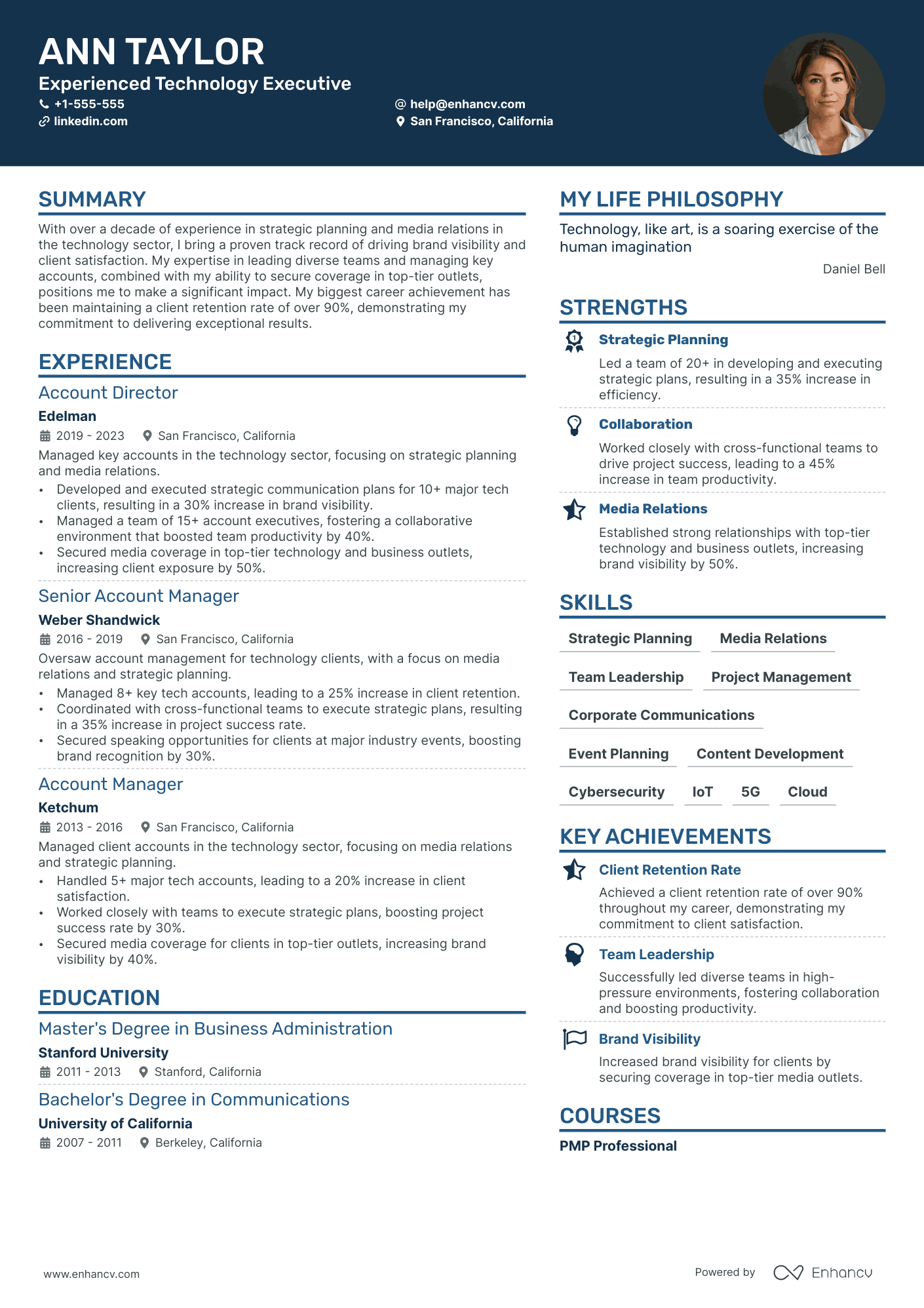
Creative
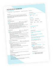
This creative design draws attention to your header, making a memorable first impression that encourages recruiters to delve deeper. Versatile and adaptable, it suits a wide range of industries and allows you to personalize it with a profile image.
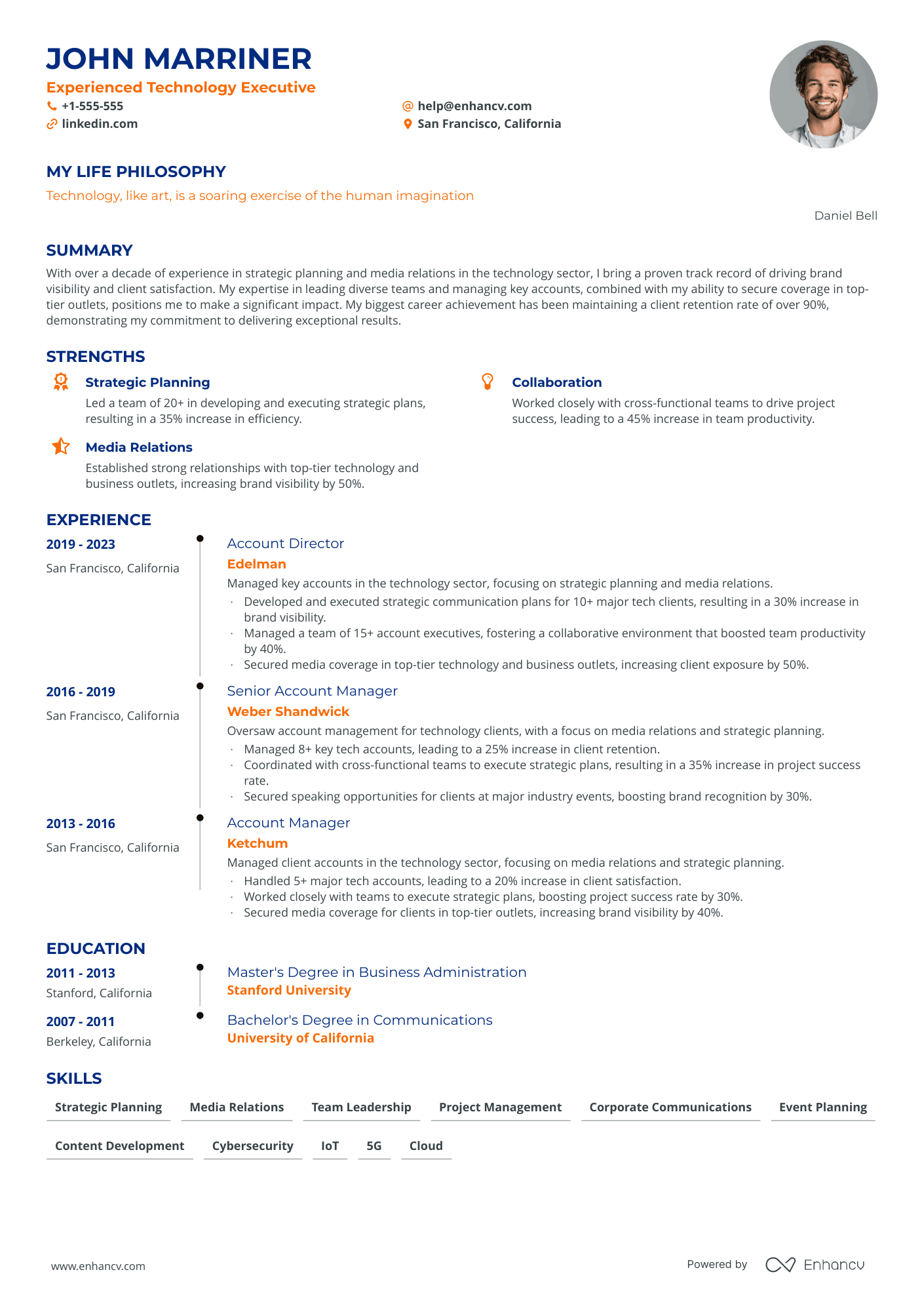
Timeline
The Timeline template features Enhancv’s signature timeline layout, showcasing your career progression and development in a clear, engaging format. Ideal for professionals at any stage—from entry to senior level—it’s especially suited for fields like operations, business, and logistics, with the option to add a profile image for a personal touch.
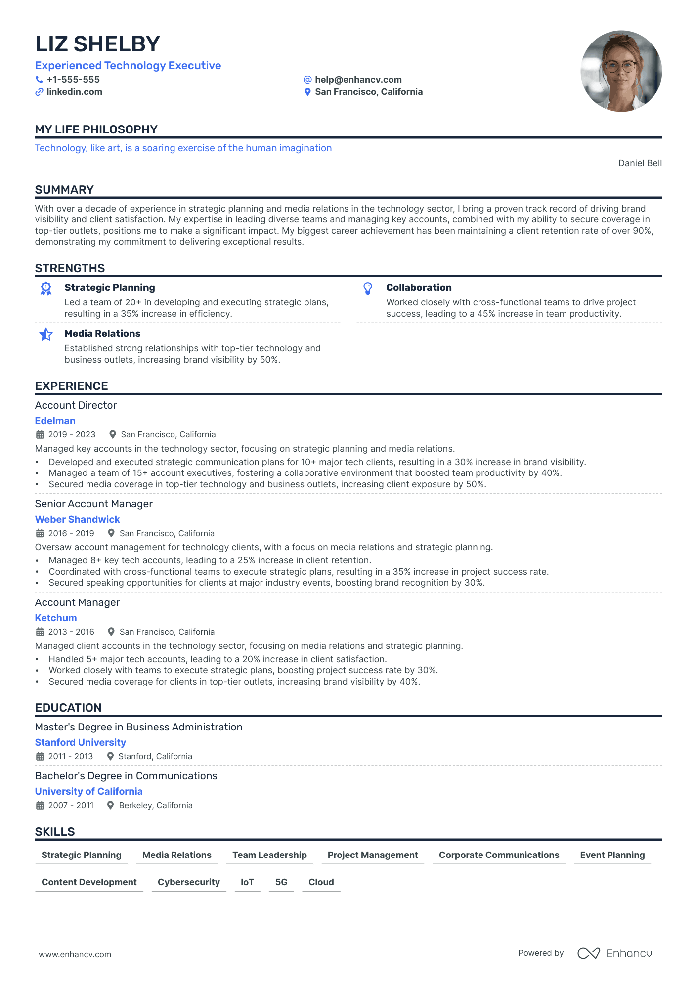
Single Column
This single-column classic design uses highlighted headings to improve readability, helping recruiters quickly capture your qualifications. Optional profile image customization available.
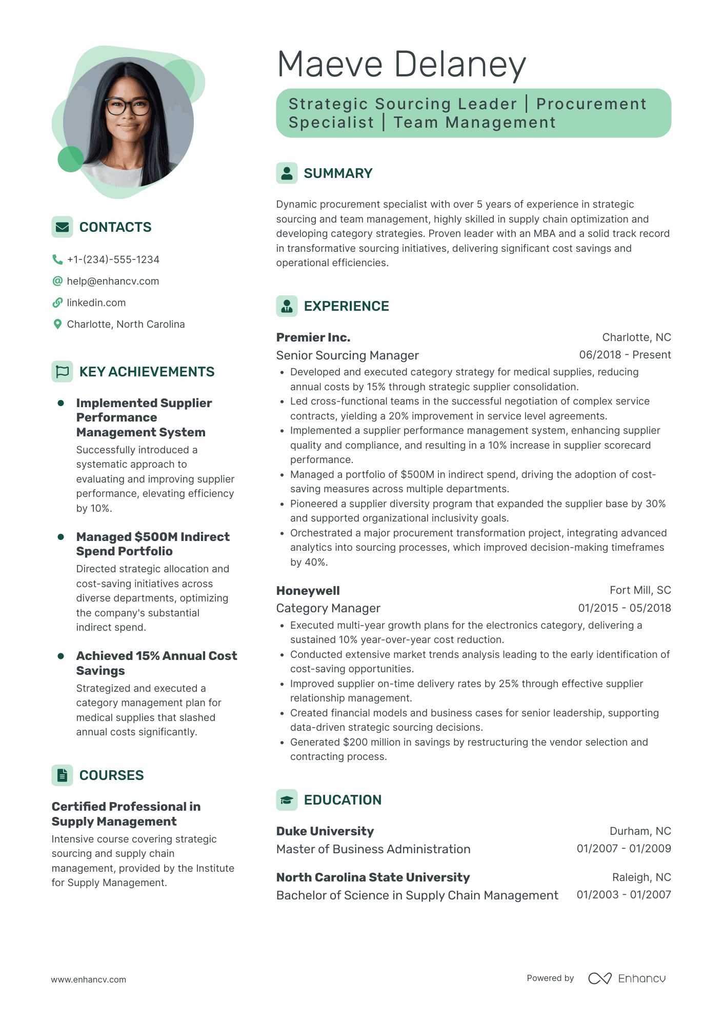
Contemporary
A clean, modern resume template showcasing key achievements, experience, and skills, designed to make any professional's strengths stand out. The photo accent adds a personal touch, helping you create a memorable first impression. Perfect for anyone looking for a polished, professional design that grabs attention.
How to create a resume with a photo
Adding a photo to your resume is simple with most modern resume builders, like Enhancv, which often include templates that make space for a profile image. If you're designing your resume, just ensure your layout has a designated spot for your photo, usually near the top by your name. Keep it subtle and professional—the photo shouldn't dominate the layout but complement the information.
When placing your photo, ensure it’s well-proportioned with the rest of your layout to avoid an imbalanced look. Remember, your resume is about your qualifications first, so the photo should feel integrated without overshadowing other sections. If you’re printing your resume, choose high-quality paper and color printing for a professional appearance that keeps the photo sharp.
Best photo style for your resume
When it comes to style, a classic, professional look is best. A head-and-shoulders shot works well, ideally with a neutral or softly blurred background. Dress as you would for a job interview—simple and neat. Your photo should give a clean impression that aligns with your industry, whether that’s business attire for a corporate role or a more relaxed look for creative positions.
The background plays an important role, too—keeping it uncluttered and neutral allows the focus to stay on you, rather than distracting elements. If possible, use natural light or soft indoor lighting to avoid harsh shadows. A well-lit, high-quality image conveys professionalism and shows you’re serious about the position.
Are photos on resumes a good idea?
This one depends. In countries like the U.S. or U.K., it’s generally recommended to avoid resume photos due to anti-discrimination laws and bias concerns. On the other hand, a resume photo is often expected in many European, Latin American, and Asian countries. If you’re applying internationally, check the norms for that location. When in doubt, consider whether a photo truly enhances your application or if your qualifications speak strongly enough on their own.
Even within regions, industries differ on resume photo expectations. For example, photos are more common in client-facing fields, such as marketing, sales, or hospitality, where personal presentation may be a factor. But for fields like tech or finance, a photo can sometimes seem out of place. Always consider both the regional and industry standards before including a photo.
What type of photo is best for a resume?
Choose a professional, well-lit photo taken with a high-quality camera. The best option is often a recent headshot where you’re directly facing the camera. Avoid casual or group photos cropped from social media—these might look blurry or unprofessional on your resume. A professional photo makes a great first impression and avoids any pixelated mishaps.
If you don’t have access to professional photography, use a smartphone camera with high resolution, and set it up against a clean, neutral background. Make sure to use a stable surface or tripod to keep the photo steady. It’s better to invest a bit of time in getting the right shot than risk using an image that doesn’t convey the professionalism you want to project.
Should you smile in your resume photo?
Yes, a friendly, approachable smile is ideal. Think of it as how you’d naturally smile in a meeting—it should feel warm but still professional. Avoid exaggerated or overly formal expressions; a subtle smile can convey confidence and approachability.
A smile can make a big difference in how recruiters perceive your photo. Studies show that people who smile appear more likable and confident, qualities that are often valued in a potential candidate. However, keep it genuine—a forced smile may come across as stiff, while a relaxed expression can make you seem more relatable.
Dress code for resume photos
Dress as you would for an interview in your industry. For corporate roles, opt for business attire; for more relaxed fields, choose smart-casual clothing. Keep accessories and colors minimal to avoid distractions, and stick to attire that complements your overall resume style.
If you’re uncertain, lean toward more formal clothing choices, as these are generally safe and convey professionalism. Avoid busy patterns or overly bold colors, as they can distract from your face. Dressing well in your resume photo signals that you’re prepared for the position and have put thought into your application.
Alternatives to including a photo on your resume
If you decide against a photo, there are plenty of ways to personalize your resume. Consider adding a professional resume summary at the top, or focus on designing sections that highlight your skills and achievements visually. Instead of a photo, include links to an online portfolio or LinkedIn profile where employers can find a picture if they’re interested.
Including a summary or skills section at the top of your resume gives it a personal touch without a photo. For creative industries, linking to a portfolio can showcase your work visually, adding depth and personality to your application without requiring an image. This way, you keep the focus on your skills and experience while still providing a sense of who you are as a candidate.

