Creative Resume Templates
Creative resume templates don’t have to be out of the box to win your job. Instead, you can use our clean templates with unique sections to stand out from the pack.
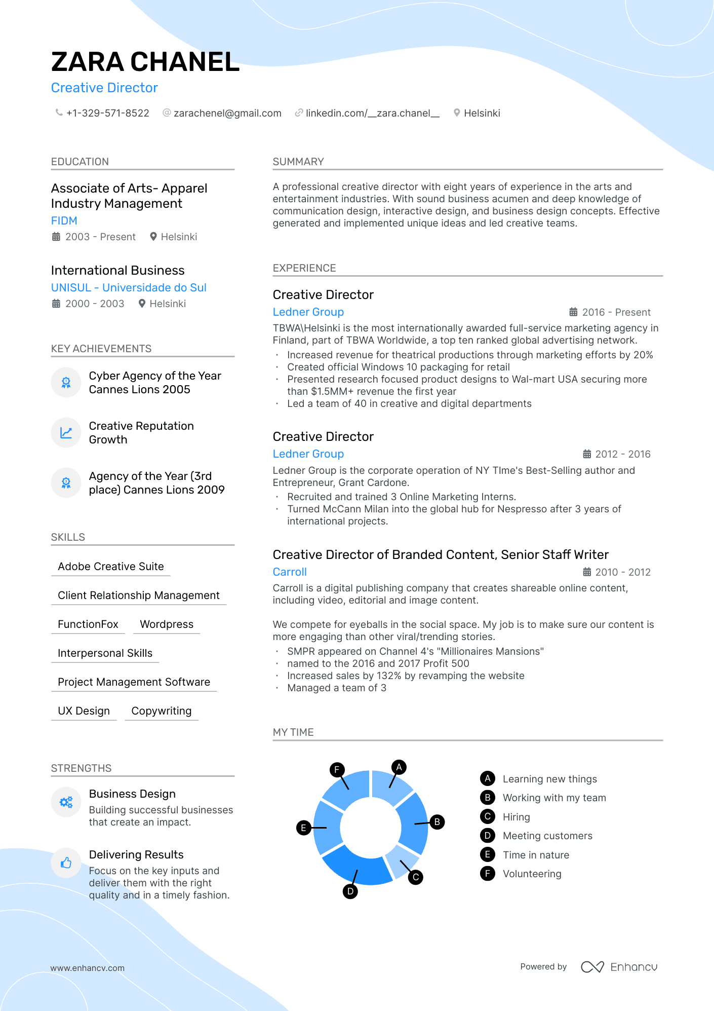
Stylish
This template enables you to design a comprehensive one-page resume, ideal for listing your abundant skills and projects as a software engineer or data scientist.
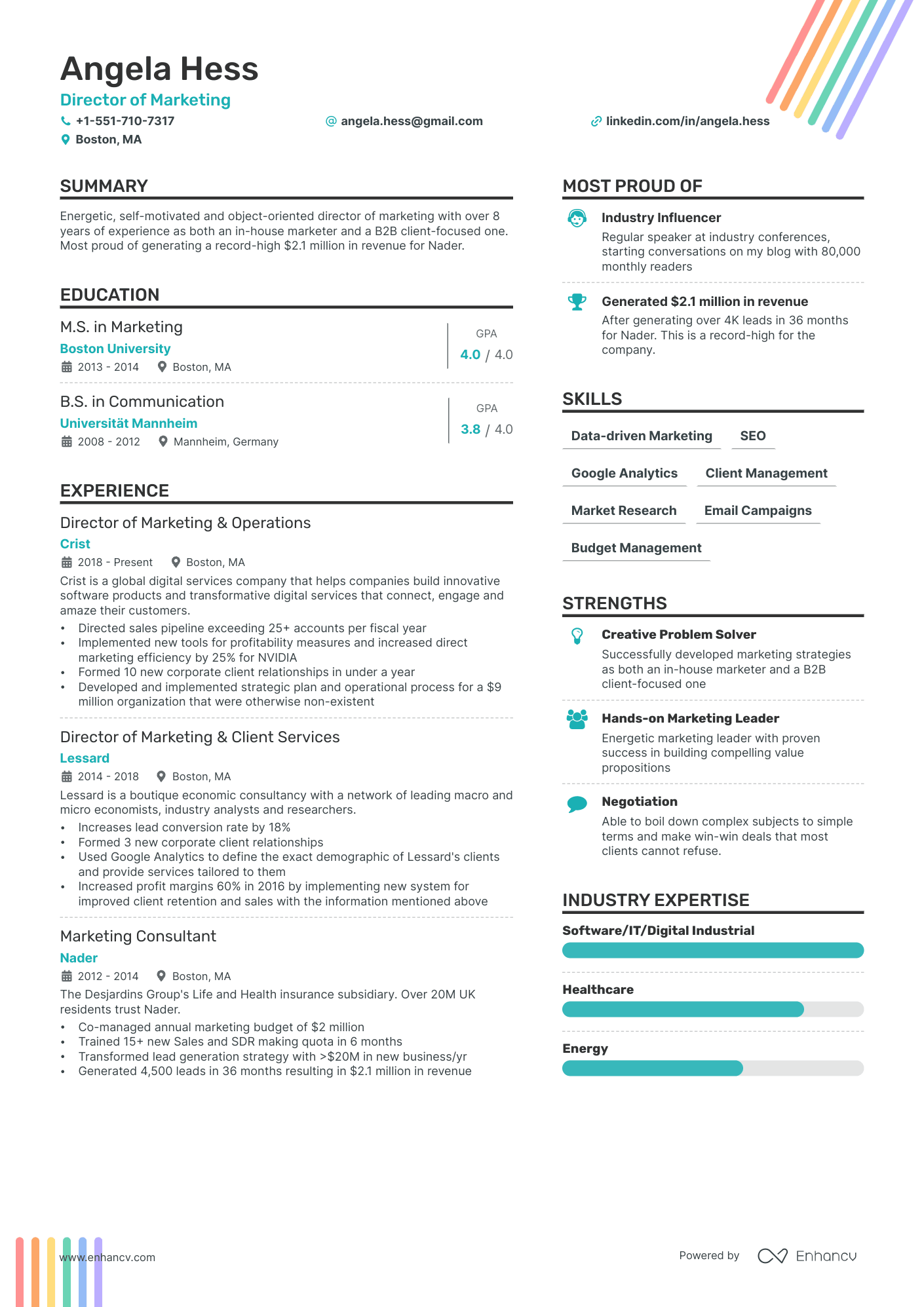
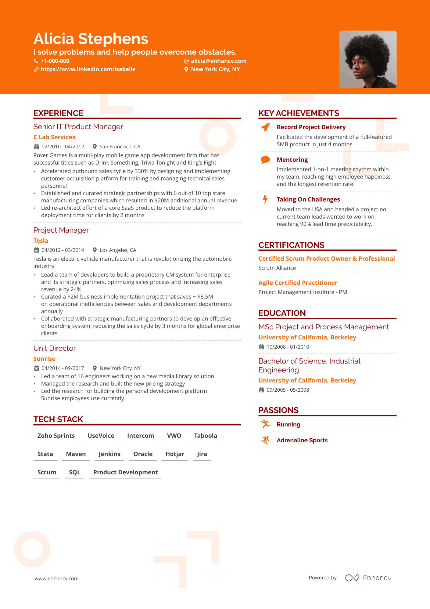
Double Column
The free two-column resume template is a popular choice for various roles, including programming and marketing.
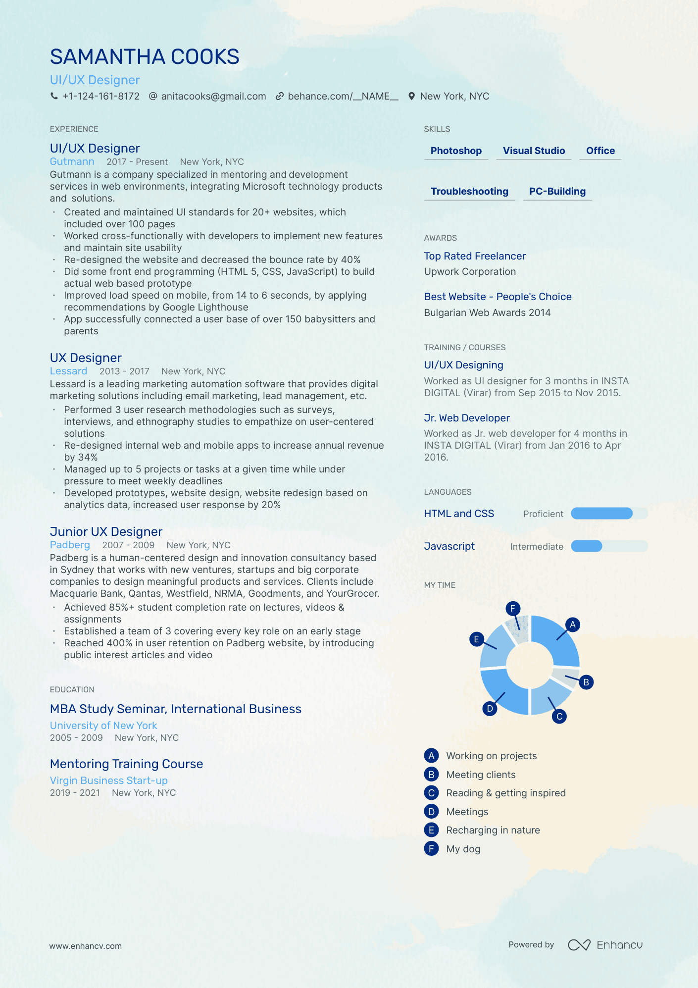
Compact
This one-page resume template is perfect for mid-level professionals with 3-10 years of experience and boasts a creative and colorful background design.
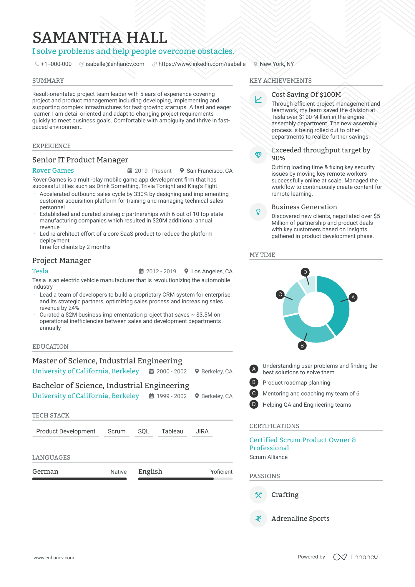
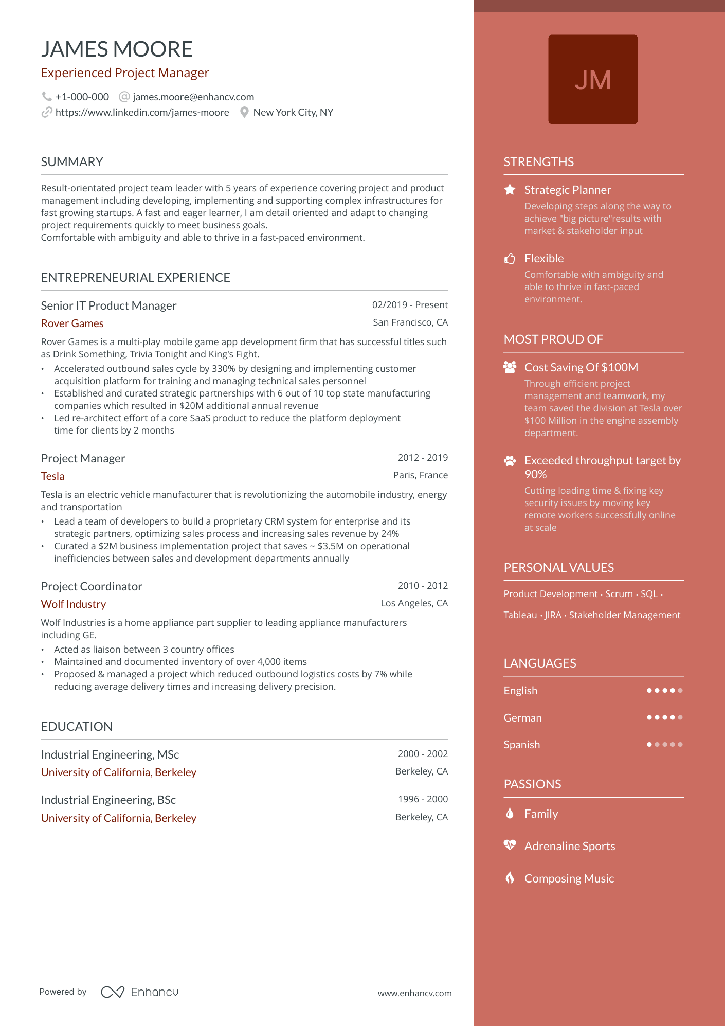
Modern
The top choice for 2023 among upper management, project managers, and product owners is this highly popular template.
What is a creative resume template?
The creative resume is very unconventional. It could take any form, and it is not limited by anything. It could feature QR codes, videos, graphics. Some people even make dedicated websites or resumes in the form of cereal boxes, board games, horror posters, etc. There are some extreme examples and oddities. Simply said, the creative resume template can showcase your creative skills without the limitations of the classical resume.
Creative resumes are a bit different from conventional ones because they can go beyond the 2d standard and directly showcase certain skills instead of just listing them.
Although there are no limits and one could even make a resume in the form of an air balloon, for the purposes of this guide we will look at creative resumes that are based on more traditional structure. It is important to note that your resume could be a 100% creative resume, or you could make a standard resume with creative elements
Pro tip
When to use a creative resume template?
Personality: This type of resume template is very suitable for artsy, easy-going, and hip people. If you feel that you are a creative person, and you have something to show to the world, then the creative resume is a way to find the right place for your talents. If the employers like your individualized resume, they will probably be content with your future work. As a result, you will easily fit in your team. In a way, with the creative resume, you can test if the employer is the right one for you and your ideas.
Professional field: The creative resume template is suitable for creative or entertainment industries such as Filming, Photography, Design, Information Technology, Music, Dancing, Marketing, etc.
If you wear a suit, scrub, or uniform at your job, the creative resume template is probably not your best choice. Examples of industries that do not embrace this artistic approach are Banking and Finance. Actually, any traditional industry will not accept it.
Company: If you want to work for the best creative companies such as Pixar, Disney, Apple, Landor, Humaan, HBO, Netflix, Red Bull, Mayple, etc. you need to be… well … creative.
The perfect example is the young Lithuanian marketing processional Lukas Yla, who personally delivered 40 doughnut resumes to marketing and tech companies in San Francisco and got 10 job interviews.
Background and education: The conventional resume with creative elements is suitable for applicants of any background and education. The exceptions are traditional industries such as Medical Services, Legal Services, Governmental jobs, Finances, etc. and positions at the executive level or higher in any industry. On the other hand, a real creative resume without any frames is suitable for people with artistic background and education.
Hierarchy: In case your position is considered an executive managerial position, you might want to prepare a more traditional resume, although you can still use some creative elements. In general, the higher you go in the hierarchy, the less you create. The less you create, the more you administer.
Best of both worlds?
There are many benefits of using a creative resume, but there are drawbacks as well. Can you have the benefits of a creative resume while avoiding its cons? What if you are not working in the creative industry, and you are afraid that your resume will be too creative, too wild?
In this case, you can prepare a creative resume that is also professional and conventional at the same time. The recipe is simple. You can still use graphical elements, two-column layout, and colors in moderation. In this way, you will have a classical resume with creative elements. Many resume-building platforms will allow you to do exactly this.
Pro tip
Tips to build the best creative resume:
Design
The use of graphics and icons on creative resumes is highly recommended. You can use infographics to represent some measurable information. You can find cute resume templates using different icons in the Achievements and Skills sections. For example, in the Achievements section, you can use an icon depicting a cup ( trophy).
When we speak of creative resumes, there are no frames. We might not have white space at all. The different sections might be interconnected instead of visually separated. Nevertheless, in most of the cases, we observe a skillful use of white spaces and separated sections that make the document more readable.
The background is also a very important part of the creative resume template. As long as it does not affect the reliability of the text, you can use a background to create a special atmosphere. Be creative with your background. Do not just use it, so you can have a designer resume template. Instead, come up with a concept and use symbolism. Implement elements that mean a lot to you or the company.
Font
If you want to be creative, you should avoid old classics such as Times New Roman. At the same time, do not go too far. After all, your resume is not a painting but a way to convey information. We recommend you use one of the fonts that Enhancv's Resume Builder has – Lato or Raleway are perfect options. Whatever fonts you use, make sure that people can read it easily. You can use two different fonts, one for the headings and one for the text blocks, as long as they complement each other.
Colors
The use of colors is very important when it comes to creative jobs. Especially positions in the graphic design industry. The choice of colors could reflect your personality and add a personal touch to the resume. When using colors on a resume, make sure the recruiter will be able to read it. Light green text on a red background is not the best idea. Do not use too many colors unless it is part of your overall concept.
Layout
Different studies show that each recruiter takes 6-10 seconds initially to decide if a resume is worth a second look. Knowing this, it is not an exaggeration to say that the most important information needs to be presented in the first one-third of the resume. This means that the Summary section is one of the most important ones. Next to the Summary section from top to bottom usually follow the Job (Work) Experience section and the Education section. If the resume is utilizing a two columns layout, you can place opposite them Skills and Achievements sections aligned right.
Depending on your experience, you may add Languages, Hobbies, Projects, etc. as additional sections. One section you can avoid is the Resume Objectives section, as nowadays candidates frequently apply directly for a certain job and do not need to explain their objectives.
Let's have a more detailed look at the layout of an eye-catching resume.
The header is the place where you add your contact details such as name, phone, address, and email. Make sure to include an email that is professional. You do not need to write down a full address, just a city and a state are enough. If you have an online portfolio, website, social media profiles you can also include links to them in the header.
А headshot with a smile is a signature feature of a creative resume. Some applicants can also use personal logos or avatars.
The headline allows telling the recruiter who you are in a few words. When preparing a cool, creative resume, you can think out of the box if appropriate in your industry.
Next comes the Summary section. This is the place to get the attention of the HR officer with a few words about your job experience, education, and achievements. Use concentrated text packed with action verbs and keywords stating why hiring you is a good idea.
The Job (Work) Experience section is placed under the Summary section, aligned left. In some rare cases, if you apply for an academic position, you may place your Education section first. You can also do this if you are a recent graduate with very limited or no job experience. List the position you held in a reverse chronological order starting from the most recent one. Using a few short sentences, describe your duties and notable moments. Use action verbs and try to adapt the words the employer uses in the job posting for your resume.
Next comes the Education section. It is also left-aligned. The rule for the reverse chronological order applies here too. You can skip listing your High School if you have higher education unless it is somehow relevant to the position that you apply for.
If you choose the two-column format, you can place the Achievements and the Skills sections aligned to the right, just opposite the Job Experience and Education sections. Both sections are similar in a format containing just keywords or key phrases. The conventional resume uses bullets to format them. With an awesome creative resume, you can unleash your fantasy and use different icons or other graphical elements, or you could represent information as an infographic. Make sure to support your claims from both sections with information you add to the Job Experience and the Education Sections.
Selecting a two-column format for your resume is the logical thing to do if you want to have a creative resume because this will give the resume a more innovative and fresh look. It will also allow you to present more information in the first one-third of the page, which is of vital importance.
With a creative resume, the Additional sections are the place where you can make a difference and show your talent. You can add Languages, Hobbies, Projects, Interests. There is no limit. There is only one rule. Consider the relevance of the additional section to the job posting.
Number of pages
One-page resumes are much more appreciated by HR officers for practical reasons. However, as per industry standards, you can feel free to add another page for every ten years of job experience you have.
Tone
It all depends on the industry. If you are applying for a job where you will need to entertain people or use a creative language, you might have a more relaxed tone. If you are applying as a stand-up comedian for a night show, you may include a few jokes as well. In most cases, try to be formal. Use a normal and polite tone.
Pro tip
Remember, it is a business and the main goal of every business organization is profit. You might be a very creative professional, but your creative skills need to attract customers. Demonstrate in your resume that you are creative, but you also mean business. It is best if you can show results and achievements on your resume.
Creative resume template pros and cons
Pros
- Creative resumes are the best way to stand out because they are different and make an impression.
- Creative resumes are the best way to show your individuality and express who you are.
- Creative resumes are the best way to demonstrate your creative talent and might even save you a second and a third round of interviews, getting you the position immediately. They have immense power and if used in the right industry they will grant you a fast-track to the position you want.
Cons
- If the graphical content prevails and the company you apply at used ATS, you are at risk of being screened out due to a lack of specific keywords
- They are not applicable in every industry and some recruiters dislike them and think that the heavy use of graphics is unnecessary
- They take time to prepare and are sometimes hard to read and understand. The information might be presented in a new way, through a metaphor or a new concept that requires some thinking to understand

