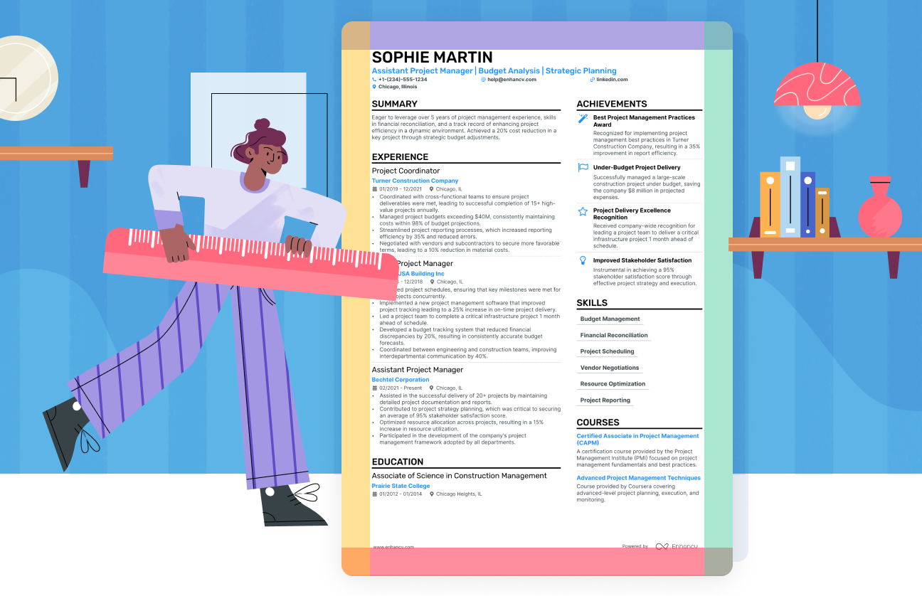
We’ve said it before, we’ll say it again—resume formatting matters! Proper formatting and design can make so much difference. Something as small as resume margins can ruin your job application if not done right. Margins provide the necessary white space to ensure your document looks neat, organized, and professional.
Surely, the content of your resume is more important than the space on the sides, but you want to make your pitch as accessible and easy to read as possible.
So, in this guide, we’ll take you through:
- What the ideal resume margins are (for digital and printed resumes alike).
- How to set your resume margins in Google Docs or MS Word.
- Some extra resume formatting tips, such as font size and alignment.
We’ll also share how we deal with margins in our resume builder, which is a fantastic way to simplify the resume creation process (make sure to check it out).
What are the correct margins for a resume?
For most resumes, the recommended margin size is 1 inch on each side. This applies to both digital and printed documents. If you need a little extra space, you can shrink the margins a bit, just keep them at least half an inch. Below, we’ve illustrated both options by applying different margin sizes to different types of resumes.
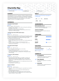
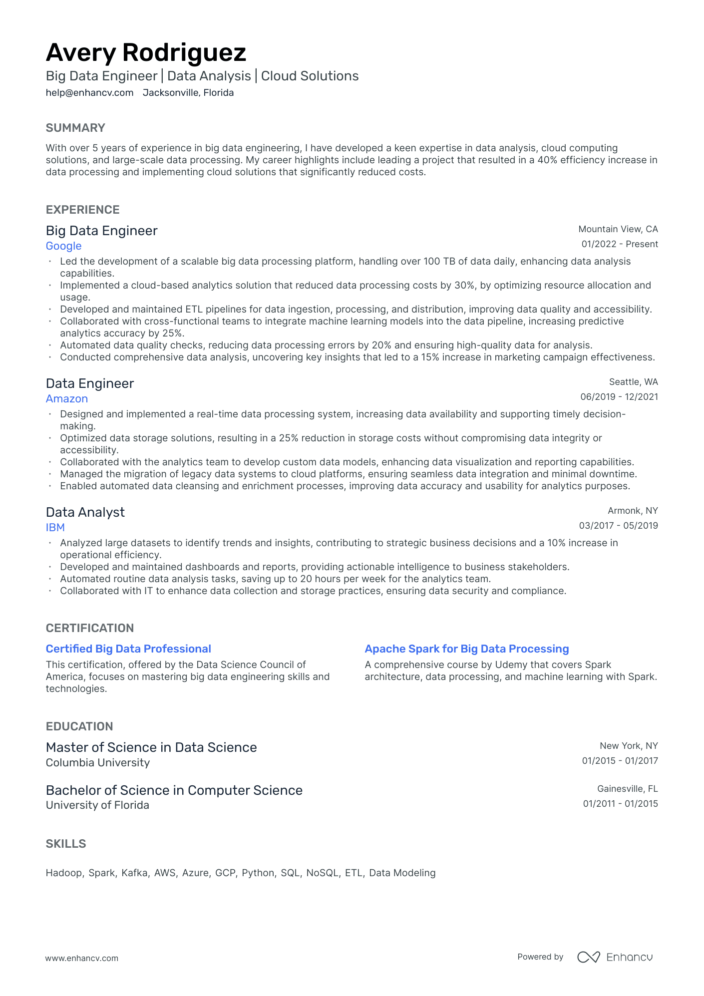
First, consider this traditional resume template:
This is a single-column resume layout—as traditional as it can get. Still, you don’t find it hard to read because the information is presented in a clear and structured way.
Here are a few reasons why the 1-inch margins on all sides work best for a resume:
- Proper margins secure readability because ample white space around the text draws the eye towards it.
- They improve the visual hierarchy and the overall accessibility of the document. Make margins narrower and you’ll get a crowded page that overwhelms the reader.
- ATS scanners can easily process your 1-inch-margin resume.
PRO TIP
The Enhancv resume builder has templates made with readability in mind. Use it to create a resume that meets all industry standards. Plus, you don't have to worry about the margins—the app ensures they are never less than 0.5 inches, even if you try to change them.
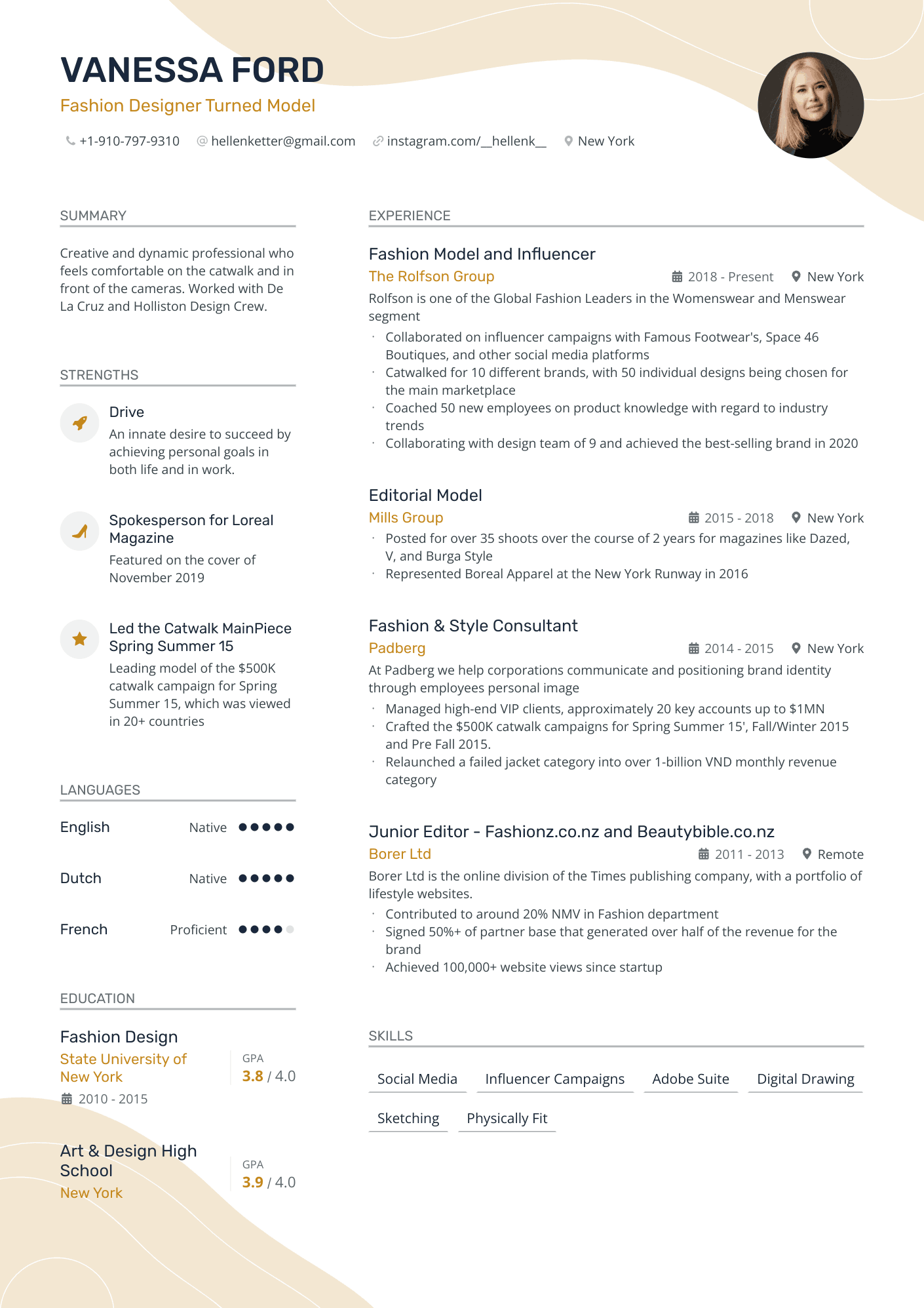
You might ask what happens to more creative resume designs. How do additional graphic elements affect margin size? Look at the example below:
If you print this type of resume with margins smaller than 1 inch, you risk having the content cut off at the edges or losing its original appearance.
It's clear that creative industries might call for a more personalized resume. However, we advise you to keep things simple and stick to the standard margin size. Visual enhancements can easily overwhelm the recruiter, not to mention confuse ATS scanners, and land your resume in the rejection pile.
Take our word for it and keep your professional document just that—professional. Let the content speak for your creativity.
Are 0.5-inch margins ok for a resume?
You might want to try and fit all the information on a single page, especially if you’ve been hypnotized with the “one-page resume” rule. That’s not a bad thing, but there are still aspects to consider.
- Relevancy: If you find yourself having to shrink your resume margins a ton, take a step back and think about whether all of this information is necessary. Fluff or non-relevant information won’t make your application look more impressive. Quite the opposite—they will most likely backfire. Remember, hiring managers only spend a few seconds on each resume to decide whether it should go in the reject pile.
- Candidate’s experience: Individuals in C-level roles or those with more than 10 years of experience likely have an extensive relevant career history to share. In such cases, 0.5-inch margins may be useful, but only if the content fits on one page. If not, consider extending your resume to two pages and setting the margins to 1 inch.
- Type of industry: Candidates in academic or scientific fields often need to include publications, presentations, and detailed research projects. In such cases, smaller margins can provide the extra space necessary for these entries. Another excellent alternative to that is creating a curriculum vitae, which is suitable for fields such as law, medicine, research, and academia. So, if you're in one of these areas, consider opting for a CV, which can extend up to three pages, instead of trying to squeeze everything into a single, cluttered page.
If you’re unsure how to filter out the noise when building your resume when building your resume, take a look at our helpful guide on the matter, What to Put on a Resume: Everything You Need to Include.
Margins for printed resumes
Even though much of today’s information is processed digitally, some recruiters still prefer to print your resume for reference during interviews. Even if they don't, it's wise to bring a physical copy to your interview—submitting a resume in person is still common for entry-level applicants, and the impact of a tangible document shouldn't be underestimated. So, here are some essential tips for preparing your resume for printing:
- Maintain standard resume margins—around 1 inch on all sides—to prevent the content near the edges from being cut off.
- Ensure the paper size is set to A4, the standard size for printed documents.
- If you’ve created your resume with Enhancv, you’re already a step ahead as our platform automatically handles font type and size adjustments. All our fonts are designed to be print- and ATS-friendly, as are the rest of our formatting options.
- Nevertheless, if you want to ensure your resume is impeccably prepared, consider reading our post on selecting the best printing paper for your resume.
These guidelines will help you present a professional resume at your next interview.
Should your cover letter margins match your resume margins?
Everything we said above applies to your cover letter, too.
Ideally, you want your whole application to be consistent–both in design and formatting. So, if you’re wondering whether your resume margins should match your cover letter margins, the answer is yes.
How critical are proper margins on a resume?
You might not think that resume margins are a big deal, but they are—truly!
1. A well-formatted document can be a handy tool in your job hunt efforts.
Margins, in particular, are a key aspect because of readability. If there’s too little white space on the page, your resume can look cramped, busy, and overall difficult to read. Especially if you’ve added a ton of information.
The exact opposite is true for resumes with giant margins. Leave too much white space, and the page will look empty and, frankly, unimpressive. Like you don’t really have that much to say and, by extension, offer the company.
2. Consistency is another factor contributing to the importance of resume margins.
Recruiters look at many, many resumes. So, it’s inevitable that their mind will create, and therefore expect, specific patterns. They’re used to seeing standard formatting, including small details like margins.
You might be tempted to break those patterns to try and stand out, but this is more likely to throw the hiring manager off. People aren’t really that fond of surprises, and a recruiter might end up focusing more on your formatting than the content of your resume.
3. Keep ATS in mind.
These systems are just as easily confused as humans are when things aren’t where they expect them to be. So, just to be safe, stick to the standard resume margins.
Resume templates with pre-set margins – enhancv vs. ms word vs. Google docs
For all of you out there who get overwhelmed by all things resume, we’ve created a super simple resume builder. As we said above, it takes care of the margins, too.
You can effortlessly switch between 5 different margin sizes. The drag-and-drop function makes it easy to play around with white space, take out or add more content, and organize your resume, so it looks its best.
You don’t need to worry about text formatting, either—it’s aligned automatically, and the line height is pre-set to fit different margins.
You can choose from our selection of suitable fonts for a resume, too, and rest assured that the text will look great both digitally and in print.
With the Enhancv resume builder, all you need to focus on is your content—we’ll take care of the rest.
To change the margin size in our editor, head over to “Design & Font”. At the very top of the dropdown menu is the “Margins” slider. You can set the font, size, and color from the same tab, too. Just play around with it until you’re happy with the result.
Changing resume margins in MS Word
Even though it can be can be very time-consuming, many people still prefer crafting their resume on Word as it has bountiful page formatting capabilities.
Changing the size of your resume margins in Word is easy. All you need to do is:
- Click on the “Layout” tab.
- Choose the very first option – “Margins”.
- You can choose one of the pre-set sizes from the dropdown menu (e.g., Normal for 1-inch margins).
- If you want to set your own size, select “Custom Margins” at the bottom of the dropdown menu and set the size.
Changing resume margins in Google Docs
The process is just as simple in Google Docs. Here’s how to change resume margin size:
- Click on the “File” tab.
- Select “Page Setup” from the dropdown menu.
- In the following window, click “Pages” and then choose the size of the margins. You can edit all margins separately.
- Optional: You can also drag the tiny downward triangle of the ruler located at the top of your Google doc. Click View > Show ruler if you can’t see it.
That’s all!
With that being said, it’s quite difficult to build a good resume on any of those word-processing programs. The process takes longer and is far from failure-proof. Meanwhile, you can’t go wrong with a ready-made resume template which will save you time for more important tasks rather than calculating margin size and alignment. Choose any of our AT-optimized templates and work from there.
Is your resume good enough?
Drop your resume here or choose a file. PDF & DOCX only. Max 2MB file size.
Alignment, font size, and style rules to follow on your resume
So, now we’ve covered everything you need to know about proper resume margins. Before we wrap it up, here are some bonus resume formatting tips:
- Font size: As a general rule, you should keep the font size between 10 and 12 pt. Normally, the smallest size for print is 6 pt, but your best bet is to avoid this rule when it comes to your resume. You want to keep the text legible, after all.
- Font style: While you may be tempted to use a fancy-looking font, that’s not the best call for your resume. Again, readability is key, so a simple, recognizable font like Arial or Times New Roman is a good choice. Our resume builder offers perfectly readable options like Lato, Rubik, Calibri, Bitter, and PT Serif. Choosing the right font can help you grab attention and leave a positive impression on recruiters. The idea here is to just keep it simple.
- Text formatting: When it comes to formatting, don’t go crazy and use it strategically. Think about text hierarchy—you can make your name, headers, and titles bold and a little larger, but keep the rest consistent.
- Alignment: Тo keep your resume easy to read and follow, align the text to the left. Also, add the more important details on the left side of the document – your education and work history, for example. Secondary information, like interests and skills, can be put on the right.
Truths and myths around resume margins on the internet
We thought it would be a good idea to check what other people on the internet think about resume margin standards. Then we’ll comment on how this applies to the latest best practices.
Take a look at some comments that stand out from this Reddit thread, here and here:
1. If you have a professionally-looking resume, the exact margin size is less critical. Truth: The overarching consensus is that the resume should look professional. Margins that are neither too narrow, nor too wide are generally acceptable. So, if we don’t focus too much on exact figures but trust our own idea of aesthetics, then any resume that looks uniform and organized should work with recruiters.
2. I'm all for setting the top or/and bottom margins to 0.75 or 0.5 of an inch if it allows you to include more empty lines between sections. Truth: Adjusting margins slightly is a good solution to optimize space without compromising the overall look. Ensuring ample white space between sections can help make the resume easier to read and scan, which is crucial for hiring managers.
3. To save more space (especially if you feel better with a larger font), you can also make your name and contact info into a header. Myth: Well, you can do it, but don’t. The resume header is your chance to make a lasting impression and you don’t want to ruin this part of your application.
4. I'd ask your career services office if they have a template you can use for your resume. Truth: This is a smart move for those approaching job hunting through a local employment office. If you’re new to job applications, this approach can save you a lot of time. The career office might provide you with an approved template, or at least answer your questions about formatting guidelines.
5. I'd be more concerned with having enough white space between the parts of your resume as they're stacked from top to bottom. Truth: This comes to prove once again that you should be flexible when it comes to resume building. White space goes beyond the margins. It can be compensated by adjusting the spacing between the different resume sections. So, don’t fixate on having 1’’ on all sides at all costs. Think about the readability of the entire document.
Key takeaways
Understanding the nuances of resume formatting is more important than most people realize, and something as simple as margin settings can significantly impact the overall presentation of your professional qualifications. Here are some key takeaways from this guide on managing resume margins effectively:
Standard margin size: A 1-inch margin on all sides is recommended for both digital and printed resumes to keep your document neat and professional.
Impact of margin size: Proper margins contribute to the document's readability by framing the content with sufficient white space, making it easier for hiring managers and ATS scanners to process.
Consistency across documents: Your resume and cover letter should have consistent formatting, including matching margins, to present a cohesive application package.
Tools for perfect margins: Utilize tools like the Enhancv resume builder or traditional word processors like MS Word and Google Docs to set precise margins, with preset options to simplify formatting.
Flexibility for space: If you're pressed for space, it's okay to reduce margins to a minimum of 0.5 inches, though this should be done carefully to avoid a cluttered look.
Make one that's truly you.

