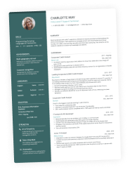
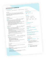
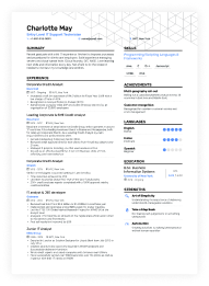
The power of a well-planned resume layout is unlimited. No joke.
Great resume layout forces recruiters to literally devour your resume.
From top to bottom, without a single yawn.
A great resume layout emphasizes your strengths and eliminates any weaknesses in your work history.
And if that’s not enough, a great resume layout helps you stand out from hundreds of other applicants.
There’s only one question left…
What does this superb resume layout look like and how do you actually create one? Glad you asked!
What's the best resume layout?
An image is worth a thousand words. Compare these two resume layout examples:
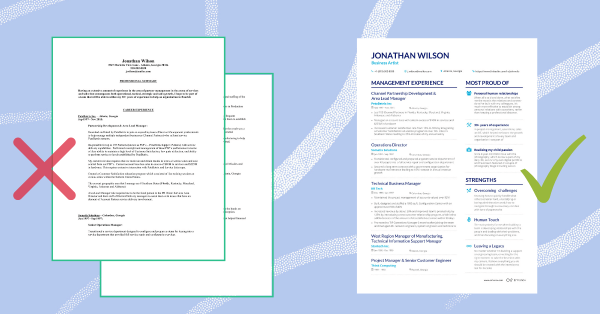
The left resume layout is your typical clunky chronological resume. According to eye-tracking studies, recruiters spend on resumes like these around 6 seconds.
On average day recruiters scan and filter through dozens and hundreds of resumes like that.
Until they stumble upon the resume layout on the right.
The combination of formatting, clever white space usage, and section order encourages recruiters to study critical parts of your resume in the order you need.
A job-winning resume layout has three main qualities:
- The job-winning resume layout is easy to read. No one enjoys reading a wall of text, especially recruiters. On the other hand, if your resume is enjoyable to read, there’s a higher chance that recruiters will spend more of their time learning about you and your qualities. At the end of this section, we’ll share a checklist with 7 tips to boost the readability of your resume and increase the chance that recruiters will like you.
- The job-winning layout is easy to scan. When recruiters scan your resume, it’s important to control where their eyes will go first. Every job is unique — depending on whether it’s an executive resume or a tech resume, recruiters will be looking for different things. Check the “Examples” section of this guide where we share the best performing resume layout examples for every job type.
- The job-winning layout is easy to remember. When recruiters like you, that’s great. But when they remember you, that’s a whole different level of appreciation. Most resume layouts are too similar to be remembered, so even a slight adjustment in section orders may pique the recruiter’s interest. Don’t go for an overkill though. We’ll share the most common resume formats and how you can use them to your advantage in the next section.
Readability and scannability checklist for best resume layout.
- #1. Check your margins. Make sure there’s at least a 1-inch margin on all sides to ensure your resume looks good in PDF or when printed.
- #2. Use white space. The proper use of white space on your resume can increase the reader’s comprehension by as much as 20%. Make sure there’s enough space between sections and text blocks.
- #3. Utilize bullet points. Presenting your experience and skills in bullet points improves both the scannability and readability of your resume.
- #4. Create headers. Headers help organize your resume sections into a clear hierarchy.
- #5. Use colors. Colors add visual interest to your resume and let the recruiter’s eyes rest from the all-black text. The more creative your job the more colors you might use.
- #6. Check your font size. For the best readability pick a serif or sans-serif font. The size should be between 10.5 and 12 points to ensure you pass ATS scanners.
- #7. Add icons when you can. Icons both add visual interest to your resume and indicate a critical section of your resume. Check out the “Examples” section.
Last, but not least, is #8: Section Order. What sections should come first on your resume? Which ones recruiters are paying the most attention to?
It depends on your resume format and job specialty.
Let’s cover both with specific examples.
3 Resume Formats That Will Define Your Resume Layout
There are three main resume formats: chronological resume (also known as reverse chronological), functional resume, and combination resume.
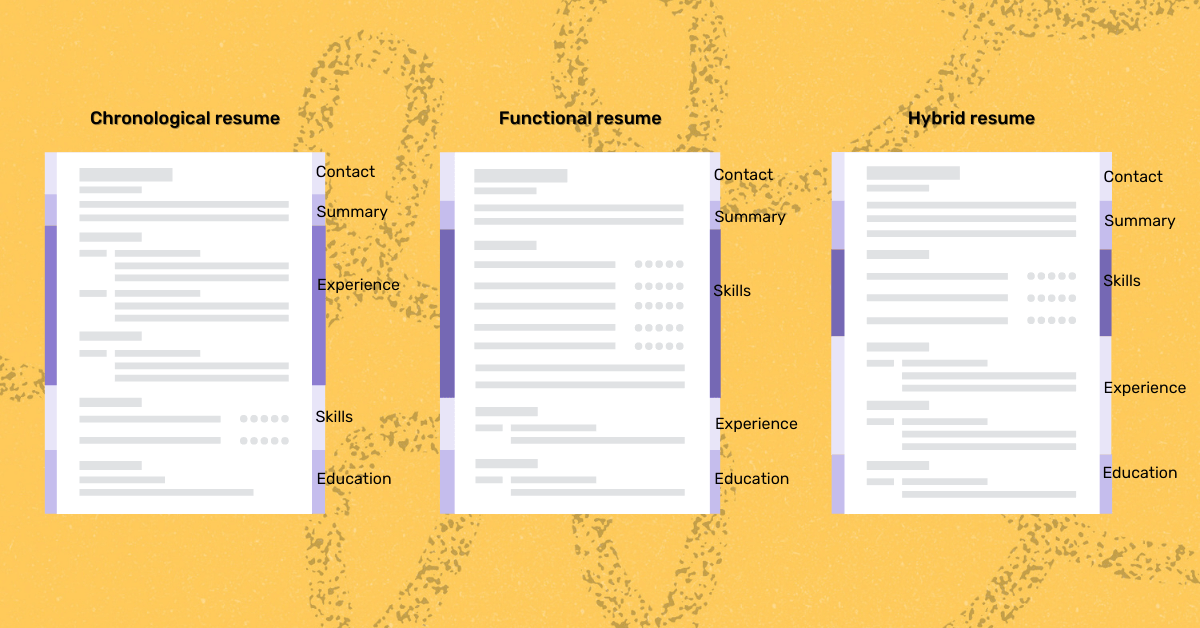
- Chronological resume. With a chronological resume format, the main focus of your resume is the Experience section. The section starts right after Contact details and sometimes is preceded with a short summary or objective. Your experience typically starts with the most recent position at the top, that’s why this resume format is also called reverse-chronological format.
- Functional resume. The functional resume is all about your skills. You list your skills and portfolio in detail, whereas your Experience section becomes shorter and more concise. Functional resume layout is rarely used on its own, and often is combined with other layouts.
- Hybrid / Combination resume. A combination or hybrid resume is a combination of chronological and functional resume layouts. A hybrid resume layout is typically used for targeted resumes when you want to tailor your skills and experience to a specific job.
The reverse chronological resume format is the most commonly used by candidates, but not the most effective.
If you want to increase your chances of engaging recruiters, you might want to modify a typical resume layout to your job specialty.
Below are templates and examples of the most effective resume layouts for different job types.
Resume Layout Examples For Specific Jobs [Gallery With HR Notes]
Best Technical Resume Layout
When looking at technical position resumes, recruiters are often searching for keywords and “big” company names, thus hiring people who already worked at “cool” companies.
This resume layout helps to balance your chances and prove to recruiters you are a viable candidate even if you didn’t work at Google before.
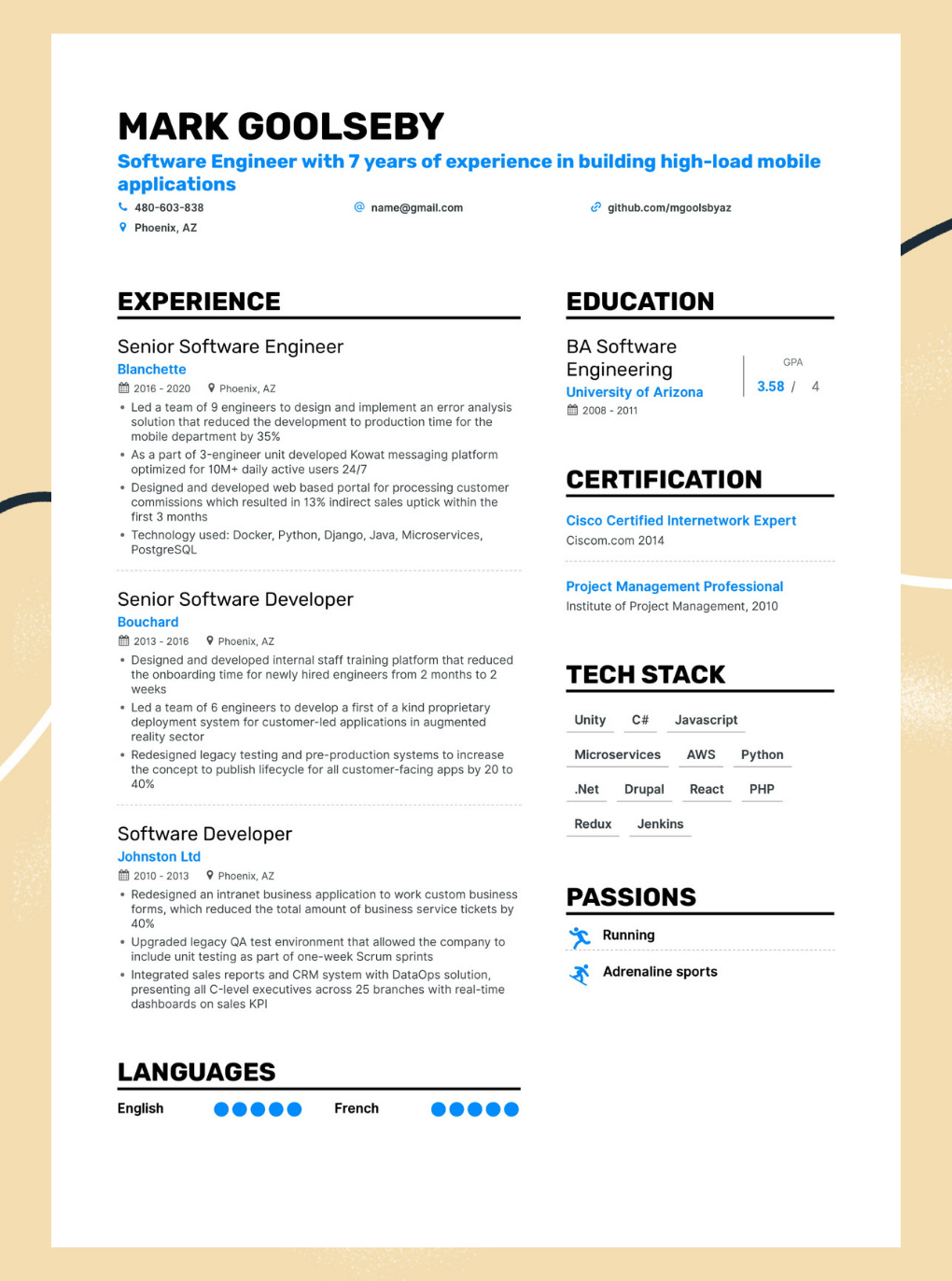
Why it works:
- Custom colored header to stand out from the competition and form a lasting first impression
- Github link at the top to guide technical recruiters
- Relevant education, certifications, and tech skills are at the same level as the experience section to build more relevance and engage recruiters
- Tech skills can be put higher if certificates and education is not highly relevant to the position [try our resume builder to quickly rearrange sections]
Great for:
- Technical positions with a strong focus on skillset
- Highly-competitive IT jobs
- Tech specialist who apply for several jobs [easy to adjust and tailor to multiple positions]
Best soft skills and sales resume layout
When applying for positions that require soft skills (sales, support, service industries) a resume can quickly become filled with cliches and generic phrases (e.g. hardworking team player) that put recruiters to sleep.
This resume layout helps keep recruiters engaged and stand out from dozens of candidates who use traditional resume layout.
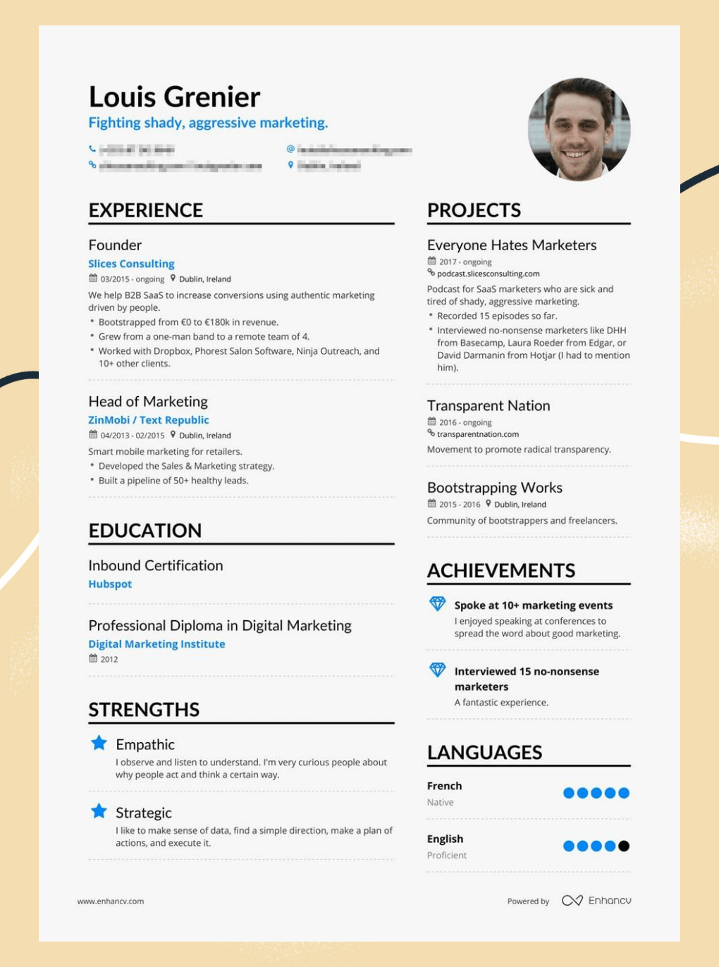
Why it works:
- Specific projects and achievements instead of a generic list with soft skills
- Custom and catchy headline to stand out from dozens of other marketers
- Icons to improve readability and grab recruiter’s attention to custom sections
Great for:
- Applying for positions at known and “hot” companies
- Standing out from candidates with the same skillset
- Making sure recruiters remember you
Best Executive Resume Layout
The majority of executives have rich work experience, so it’s hard to impress recruiters with Experience alone. This resume layout demonstrates the unique value the candidate can bring to the company and helps build up additional relevancy.
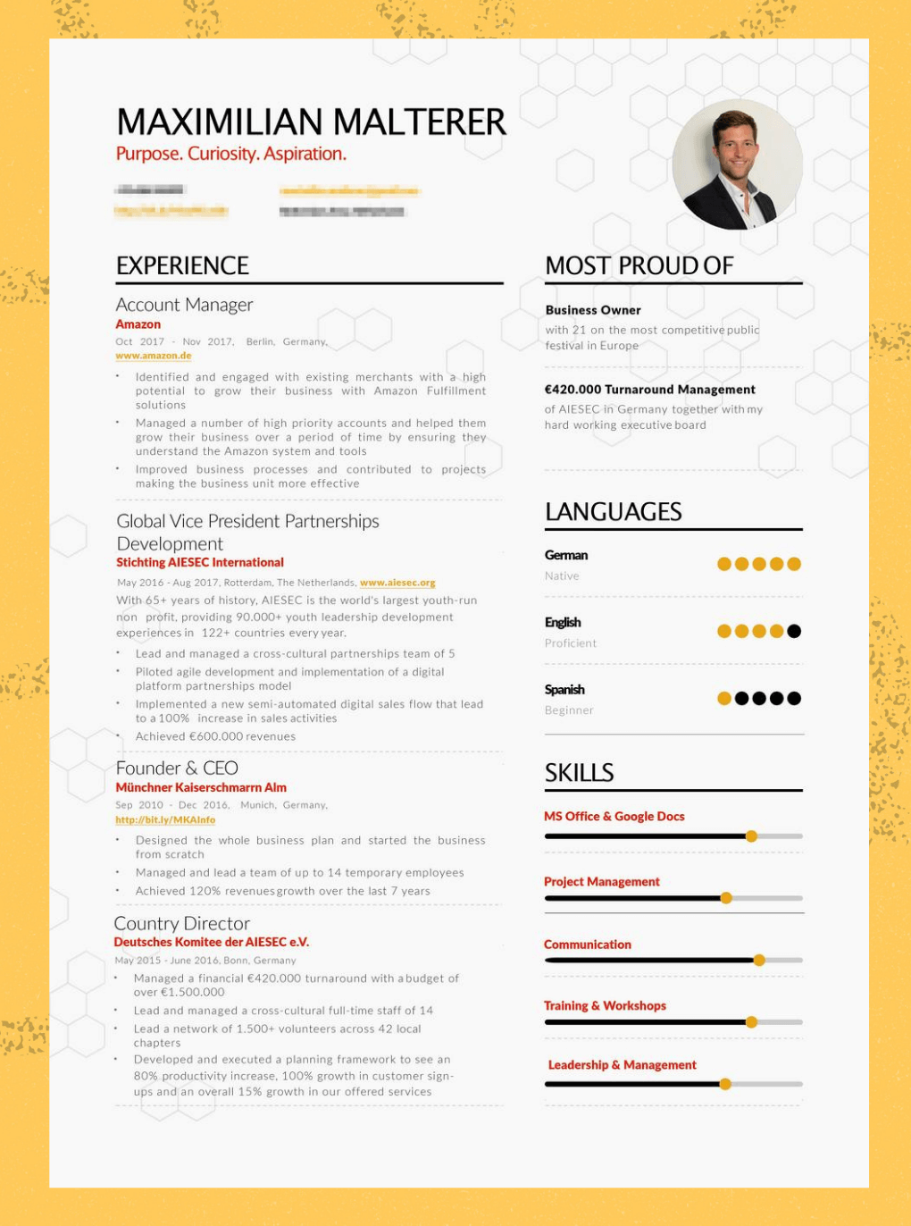
Why it works:
- Custom “most proud” section to demonstrate exclusive skills right from the start
- Header with personal values that resonate with company mission
- Engaging Skills section to create additional value on top of rich work experience
Great for:
- Middle level and high-level managers applying for competitive positions
- Executives with long work history they’re trying to fit into a one-page resume
- Candidates who spend time researching the company they apply for can adjust resume sections for a better fit
Best Creative Resume Layout
Do creatives even need resumes? You bet. Between two creatives with great portfolios, recruiters will favor the one with a better resume layout.
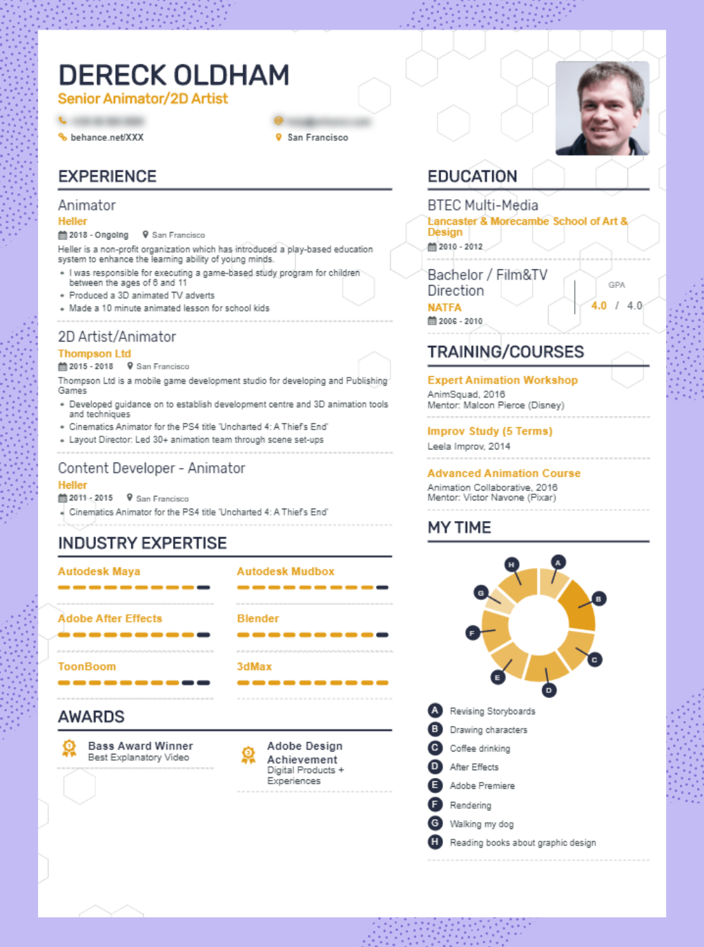
Why it works:
- Clever use of color, icons, and graphics to increase visual interest while keeping the resume clean and professional
- Experience and skills sections can be easily rearranged. For established positions, experience is more important, for new niches (e.g. VR, AI) the skill section might be the dealmaker.
- Link to the portfolio at the header to help recruiters find your work online and bookmark you
Best No Experience and Entry-Level Resume Layout
How do you write about your experience when you have none?
When recruiters fill entry positions, they know that candidates won’t have much experience. What they don’t like is when candidates are bloating things out of proportions or faking experience.
Great resume layout doesn’t create experience history out of nothing. But it can help recruiters understand your potential without looking artificial.
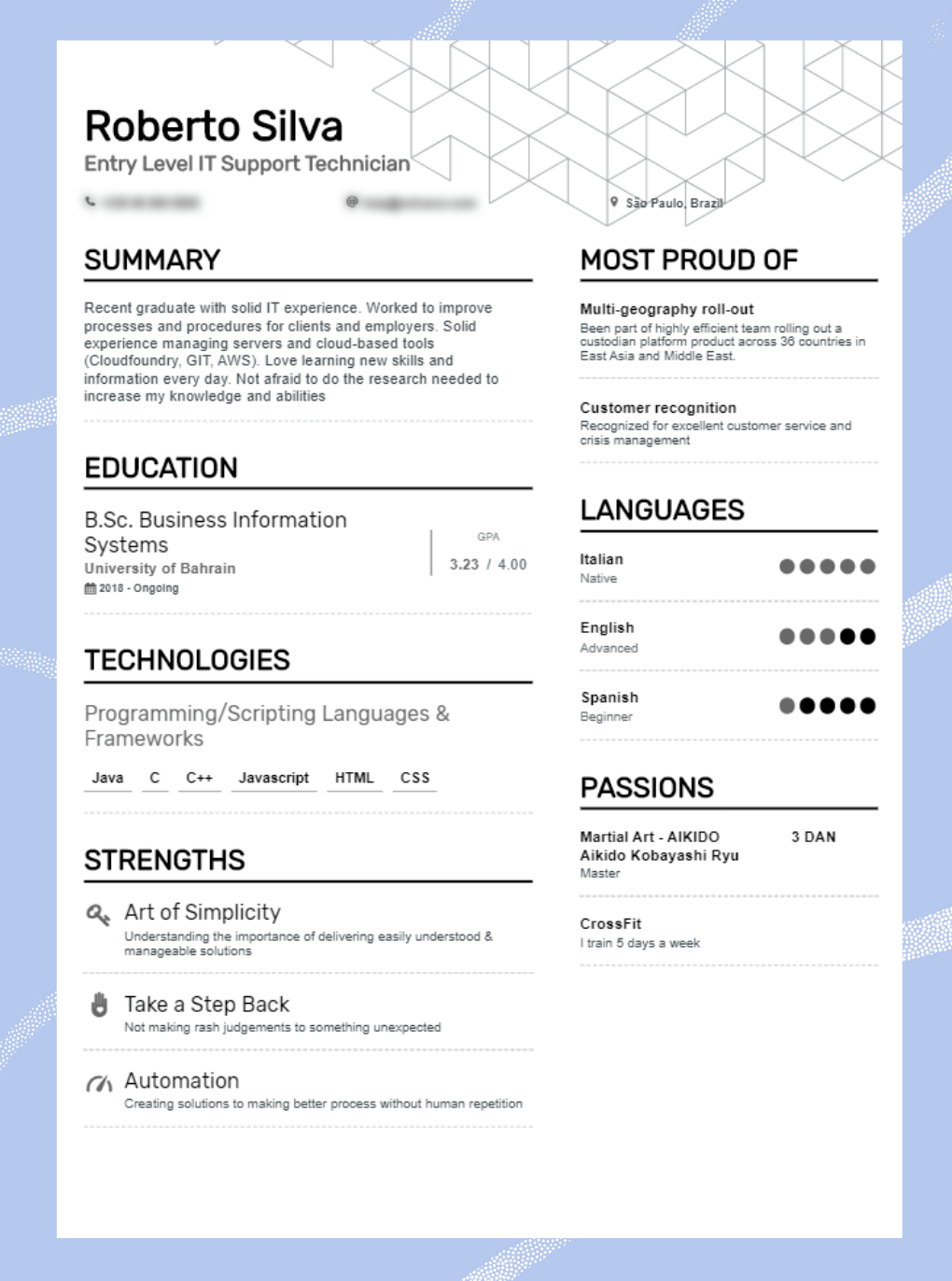
Why it works:
- The lean simple layout fits entry positions better than showing off
- This layout fills the page without too much text. Recruiters will appreciate that
- Custom sections like Strengths, Passions, and Most Proud helps recruiters to understand qualities that might be helpful in your job
Best All-Around Resume Layout Sample
This resume layout is a combination of all the best practices we used when we were helping our clients score jobs at companies such as Spotify, PwC, and Verizon.
If none of the above resume layout templates work for your specific position, feel free to use this resume outline as a baseline.
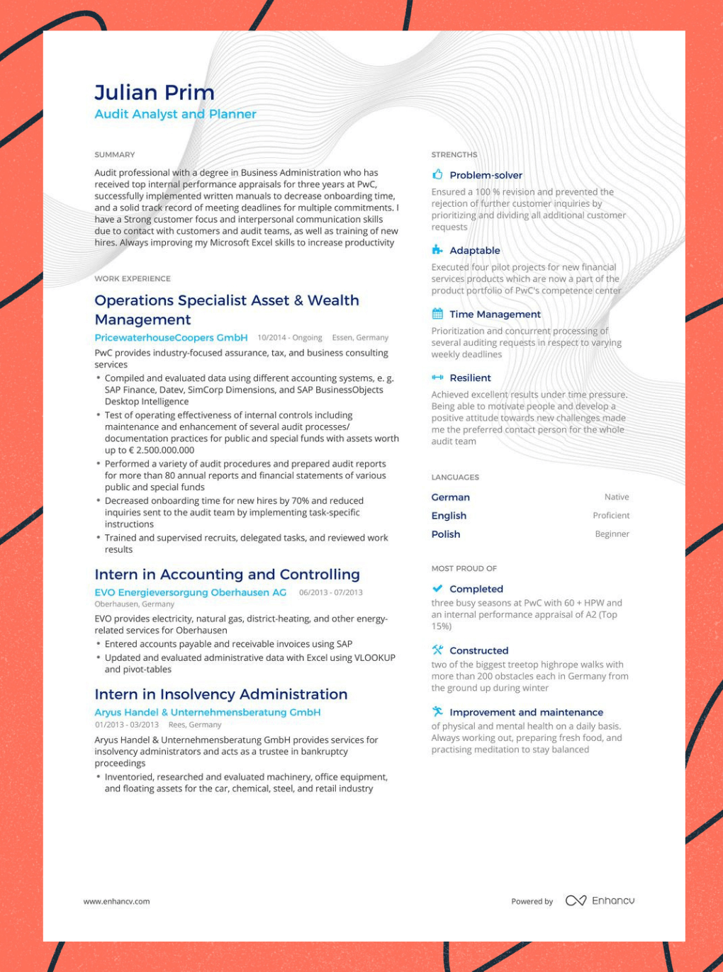
Why it works:
- A combination of reverse-chronological and functional resume layouts to stand out from the competition
- The soft skills section is not a generic list but rather a project-based demonstration of your competence
- Monochrome color to keep things interesting, yet professional
- Icons, white space, and text formatting to help recruiters scan and read critical resume sections without skipping
So what makes a good resume layout? Recap
- The best resume layout is easy to read, scan, and memorize
- The best resume layout is targeted to the specific position
- Great resume layouts use color, headers, and visual elements to keep recruiters engaged
- Good resume layout follows the principle “less is more”, balancing between concise text blocks and white space
- Sections of your resume can be rearranged to emphasize strong points
- Traditional resume layouts are hard to read and scan thus recruiters tend to skip critical information
- Enrich resume layout with a custom headline, portfolio links, and custom sections to stand out from the competition
- Use resume layout templates that you can quickly adjust to the specific position
***
Did you like the guide? What’s your preferred resume layout? Have you used any of the above before and how did it play out with your application? Share your thoughts in the comments below.
Make one that's truly you.


