Your CV is all about presenting yourself in the best possible light in front of the hiring manager.
But if you want to get the job done, your work experience, achievements, and skills would not be enough.
Nowadays, hiring managers go through hundreds of CVs on a daily basis, so they don’t have time to be impressed by all your information in the 7 seconds they spent scanning it.
To get their attention and make them read all your qualifications and accomplishments, you need to grab them with a great CV design.
A great CV design can really set you apart from the competition, and increase your chances of getting the job you want.
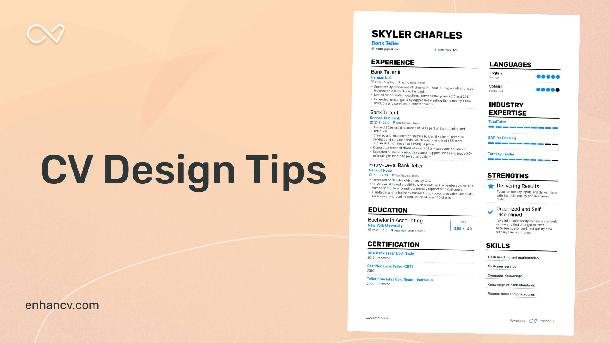
In this article, we are going to explore all things important about your CV design, how you can optimize it, and we are going to show you 3 unique CV design examples from Enhancv.
If you struggle with creating your CV, you should definitely check out our CV Builder which will help you create a unique CV in no time.
But if you are ready to focus on improving your CV design, stick around.
CV design tips
Upload & Check Your CV
Drop your CV here or choose a file. PDF & DOCX only. Max 2MB file size.
Add an eye-catching border
A great way to catch the hiring manager’s attention before they have even started reading is adding in a border to your CV.
Most of the candidates would probably go for a light gray or a dark blue border, which would only make you disappear in the pile of CVs with the same design.
However, adding an interesting border can really help your CV stand out from the crowd, and at the same time show off a bit of your personality to the hiring manager.
A thing to be careful about here is to not overdo it. The best way to go is with a flat color, simple texture, or muted pattern in your border.
After all, you would not want to distract the hiring manager from what is really important – the information in your CV.
Choose a great font
Use one or two modern, professional fonts to establish a clear hierarchy and maximize readability. Be sure to use a consistent size of 10-12pt for body text and 14-16pt for headings
When you choose a font, you should know what each font type represents:
- Serif fonts – they are often associated with professional settings
- Sans serif fonts – much more clear and modern in their appearance, a great choice if you are creative or design-oriented
- Script – rarely used, but if you are fun, warm, relaxed, or easy-going, it can really work for you
- Thin – if you’d like a text to not stand out, this is the right one. A great choice if you are more reserved, quiet, or calm
- Blocky – if you want a text to really stand out, like your name and contact information, that’s the way to go. A great font for you if you are extroverted, outgoing, or expressive
Take your time and look through your CV and figure out which time of font is most suited for each part of your CV.
Make your contact information visually appealing
Your contact information is one of the most important elements in your CV, so you need to make sure it is easy-to-find and it grabs the hiring manager’s attention.
It should at all times be on the top of your CV, and have some elements that are visually appealing. To do this right, you need to:
- Use icons – simple ones would do just fine, but make sure you add icons, instead of writing “Phone:”, “Email:”, etc.
- Use white space – you would not want to stack your contact details too close to each other, as it would lose their visual value
- Use color – one of the simplest ways to draw the hiring manager’s attention toward your contact information is by using a background color to highlight it
Use infographics when appropriate
Infographics are a great way to take your CV to the next level, or fill up your CV’s page with visually appealing information, if you still lack experience.
A combination of data visualizations and icons can make your CV eye-catching for the hiring manager and considerably improve your chances of getting an interview.
Infographics can be found in many forms, the most common of which are:
- Timelines to outline education, work experience, volunteering, etc.
- Bar charts to explain the level of proficiency in your most essential skills
- “My time” pie chart, which you can find in our CV builder, and is a great way to show your time management
Stick to a consistent color palette throughout your CV design
We already mentioned that color can be a great way to improve your CV and make it more visually appealing.
But that only applies if you know how to do it right.
In this case, consistency is key, and you need to make sure that the color palette used throughout your CV is consistent.
That does not mean that you should make it just one color, but make sure all colors you have used are working well with each other.
Follow industry norms
All these design tips are good, as long as you know when to use which.
Before you start applying every tip to your CV, you need to consider the industry you are applying for and carefully determine where the limit for your design is.
But no matter the industry, you need to be cautious of how much you tweak your CV. If you overdo it, there is a chance you will turn off your potential employer.
Use the right file type
Last but not least, save your CV in the right file type. The best one for the job is PDF, as it will preserve all your design just the way you want it.
Make sure you also name your file correctly, so that it would be easy for the hiring manager to know what exactly they are about to open.
The best way to go is to include your name and document type, for example “JohnDoeCV.PDF” .
However, if the job listing states that another file type is required, you should follow that instruction.
3 unique CV design examples from Enhancv
And now, as promised, we have some unique CV design examples from Enhancv. Check them out and see everything we talked about above in practice.
Takeaways
We are all done, now you know how to design your CV just right to grab the hiring manager’s attention.
Let’s go through it all one last time really quick, you need to:
- Add an eye-catching border, using simple elements so that they don’t take the focus away from your CV
- Choose a great font, and don’t hesitate to use more than one, if you find it appropriate
- Make your contact information visually appealing by using icons, and adding the right amount of white space, as well as some background color to highlight it
- Use infographics to highlight all the important elements in your CV in a visually appealing way
- Make sure the colors you use throughout your CV work well with each other
- Save your file as PDF, as it will preserve all your design just the way you want it (unless the job listing specifies another file type, in which case, you should follow the instructions)
Don’t forget to follow the industry norms, as not all design tips are applicable in every situation, you should consider where the limit is for each industry.
Take one last look at our unique examples from Enhancv, and improve your CV design in no time.

